Kristin Braks
Artist, graphic designer, teacher
Order and disorder from color to form
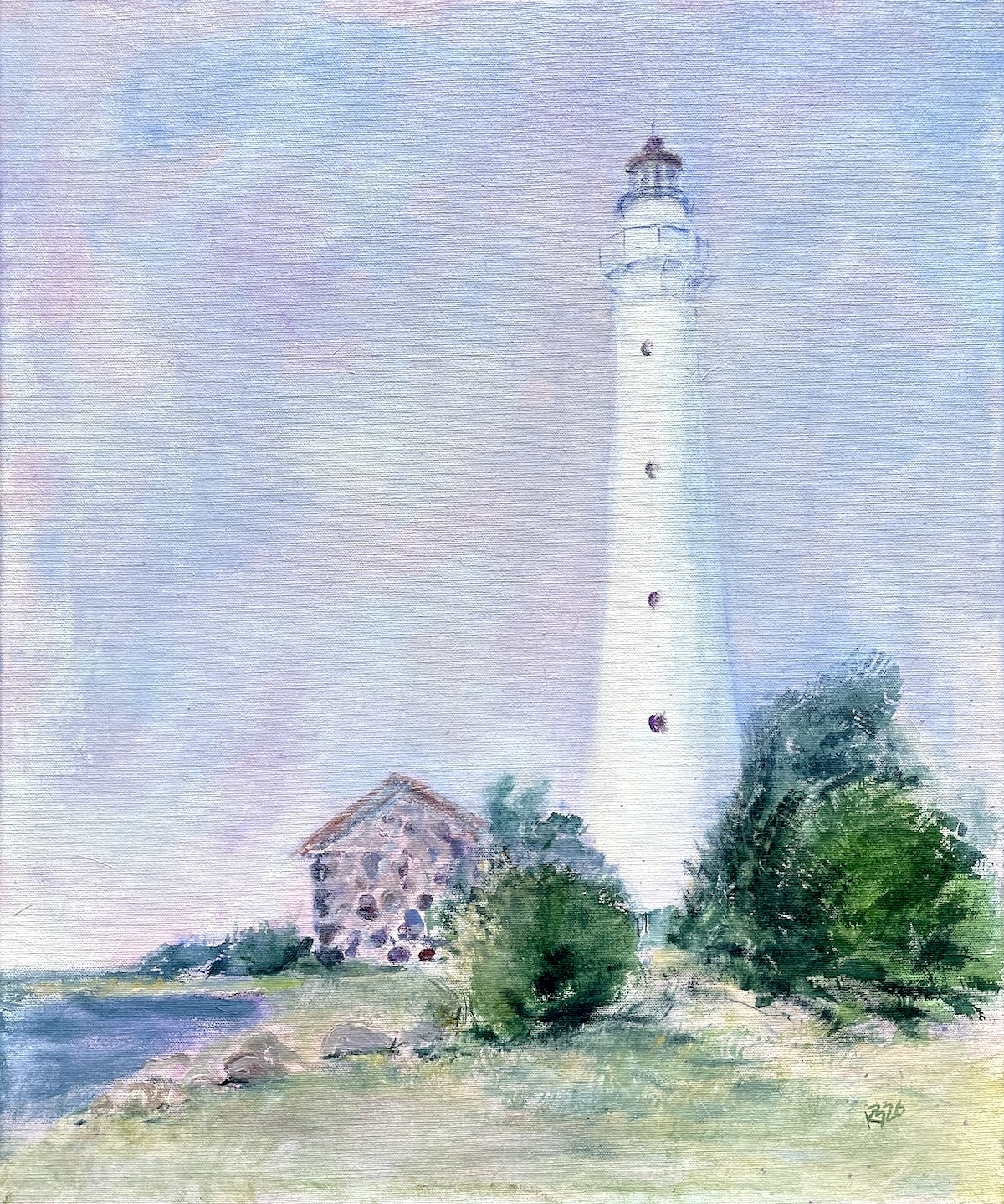
“Kihnu Shimmers”
Acrylic, 2026
“Kihnu Shimmers” is paintedplein airOn Kihnu Island, where the wind does not ask for permission to act on the beach. All the locals here are tough and determined – they withstand storms and know how to shine in the sun.
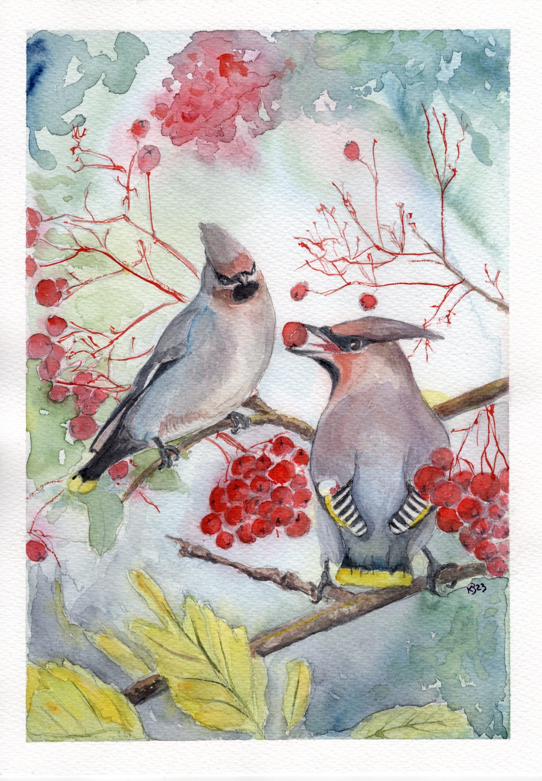
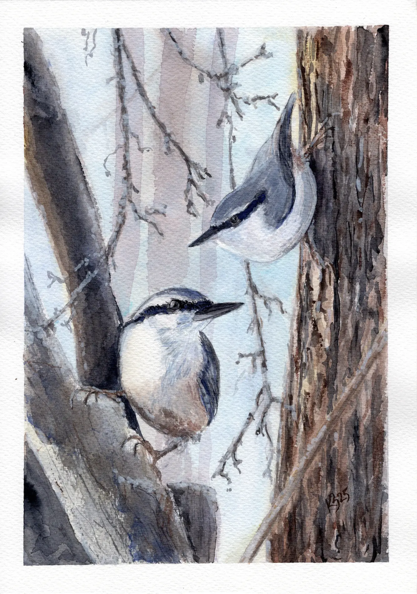
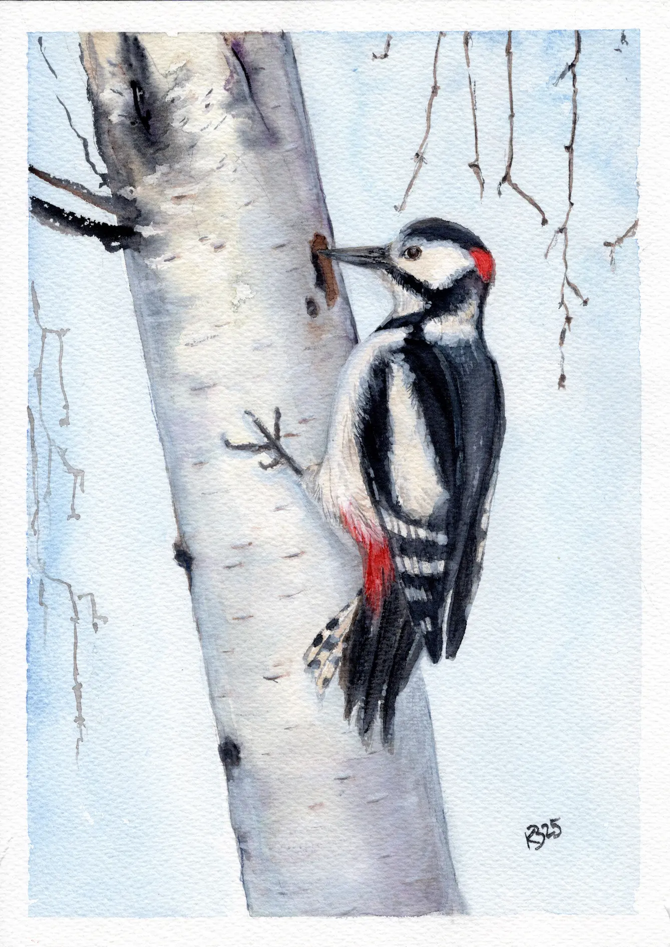
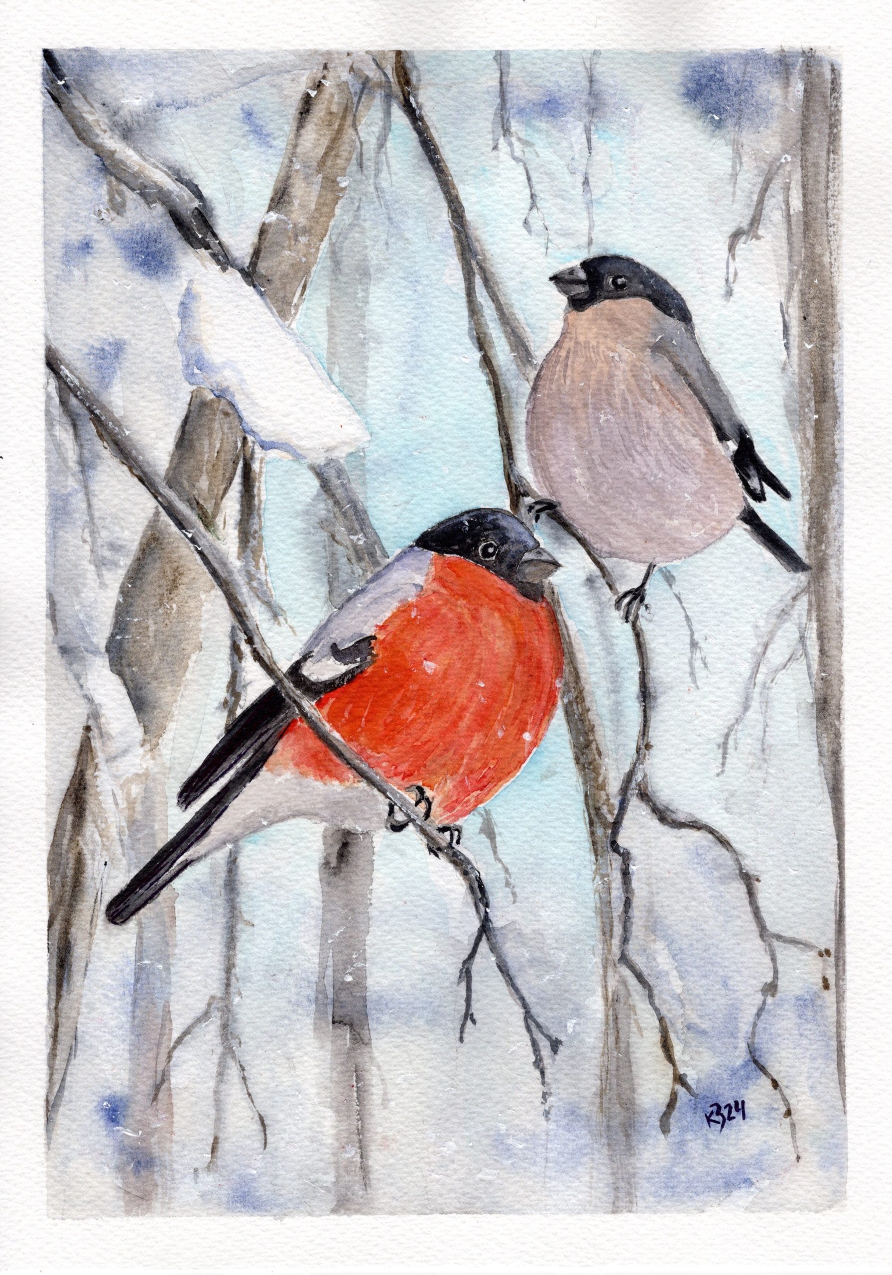
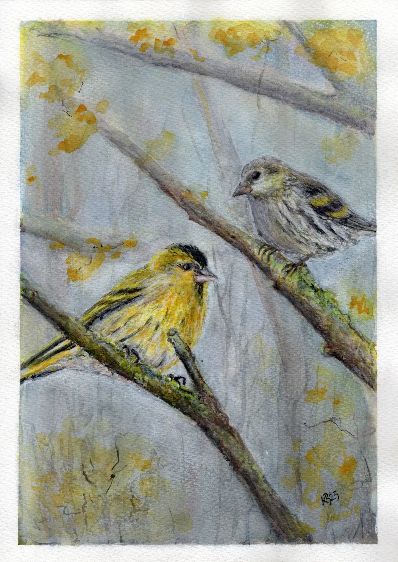
Watercolor series “Northern Birds”
Watercolor on paper, 2023 – 2026
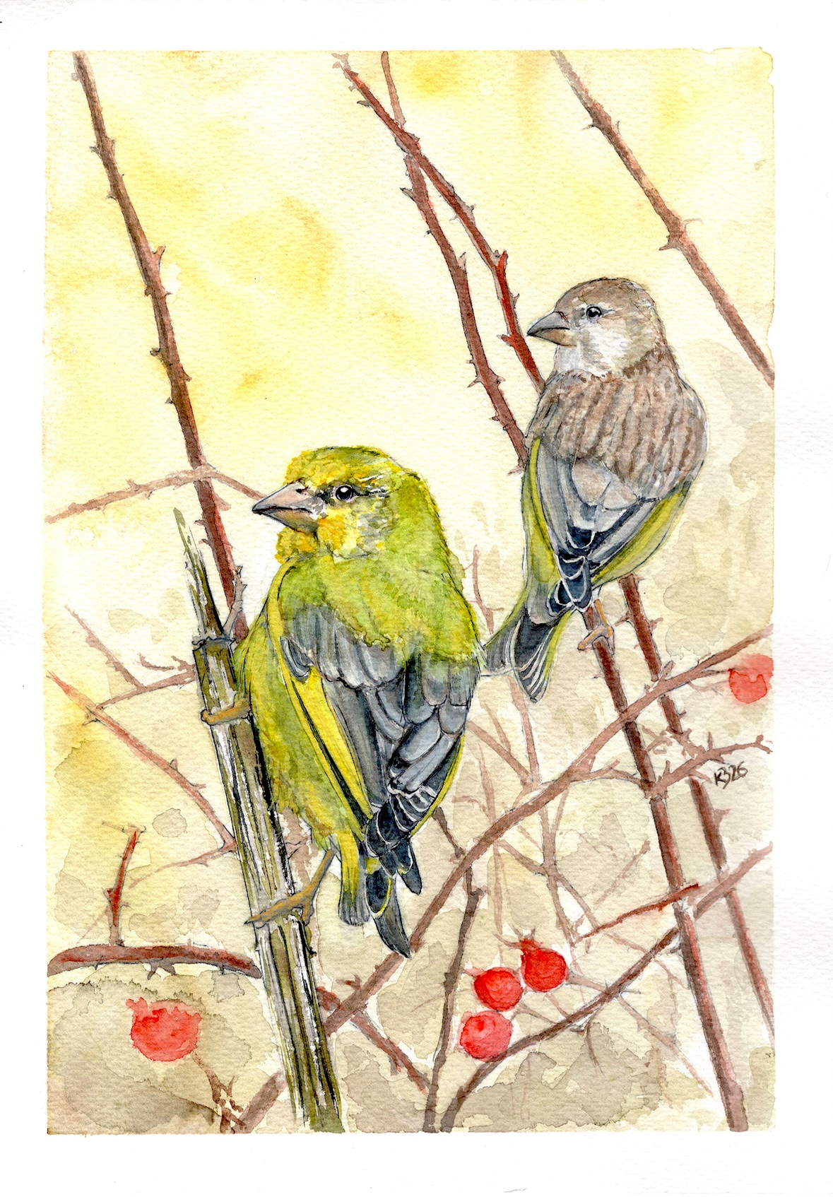
“Northern Birds” was born from encounters in the forest thicket, where I often move and work. Some permanent residents who keep out of sight have gradually become familiar by their calls, while some birds only flash by, leaving a mark with their colorful plumage. I try to capture these small wonders of nature with my brush.
Nature is full of little miracles.
Read more…
Birds don’t stay still or pose on command. Maybe that’s why watercolor is especially suitable for painting them – water and paint also tend to have a life of their own sometimes.
I am less interested in an exact portrait of a bird and more in the moment when it briefly appears: movement, color, gaze, or a characteristic pose. Some encounters last longer, some only a second, but sometimes that is enough.
The series includes forest birds familiar to me – woodpeckers, treecreepers, tits, nuthatches, and other “neighbors” or occasional visitors.
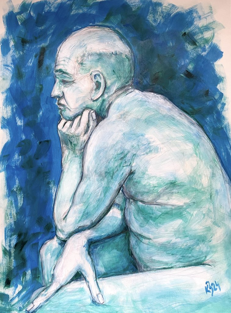
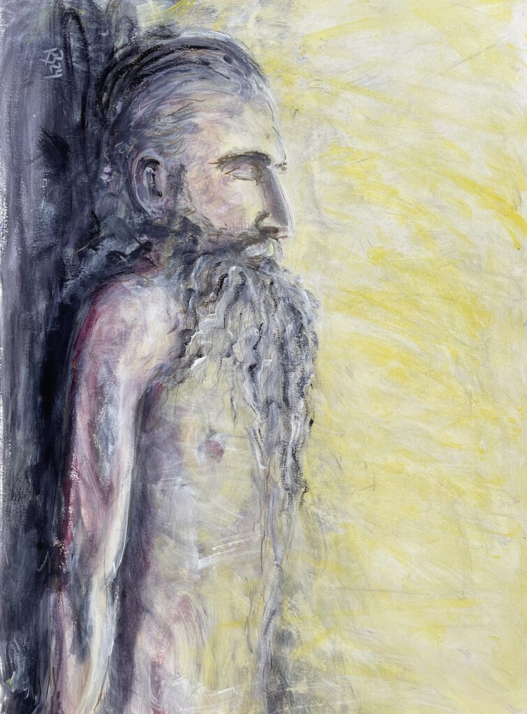
“Regimes”
Acrylic, 2024-2025
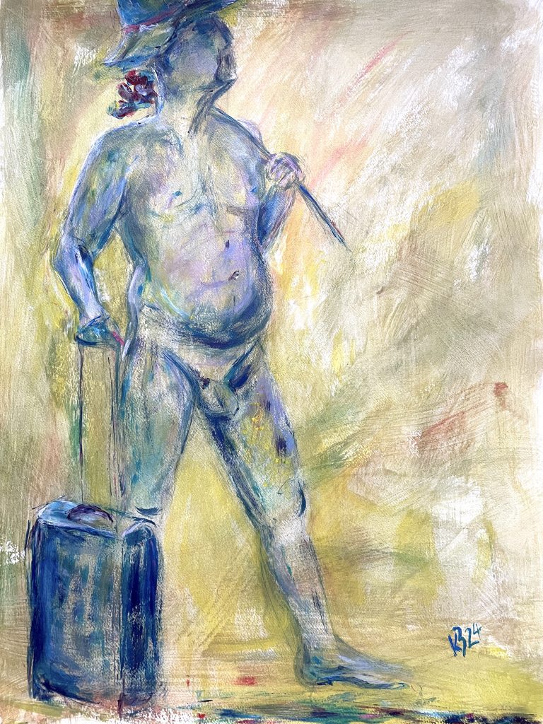
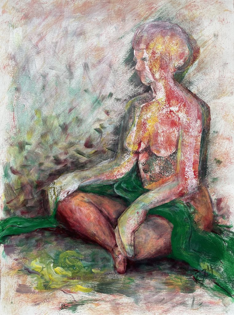
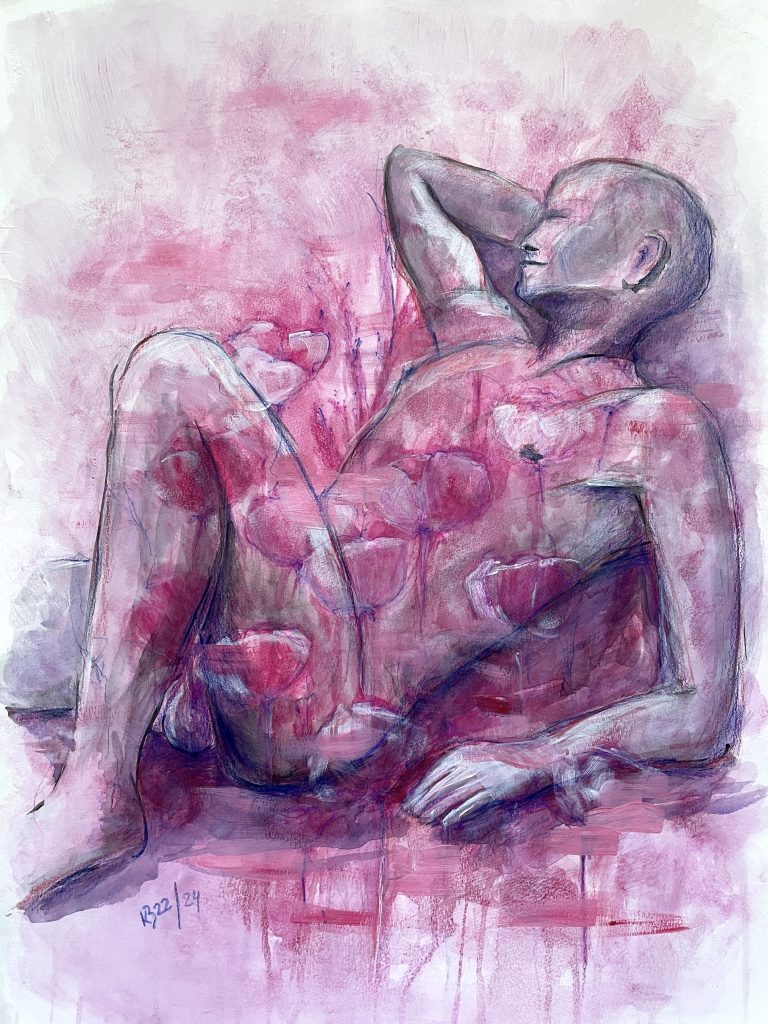
We are all in some state. Sometimes even in the one we think we are in. “Regimes” observes people in different momentary states – present, absent, or somewhere in between. I am interested in the moment when conscious control recedes and is replaced by something more immediate: a pose, a gaze, a movement, or simply being. The model seems to be in their own world and does not seek contact with the viewer. Yet their state prompts one to ask what is happening in that moment.
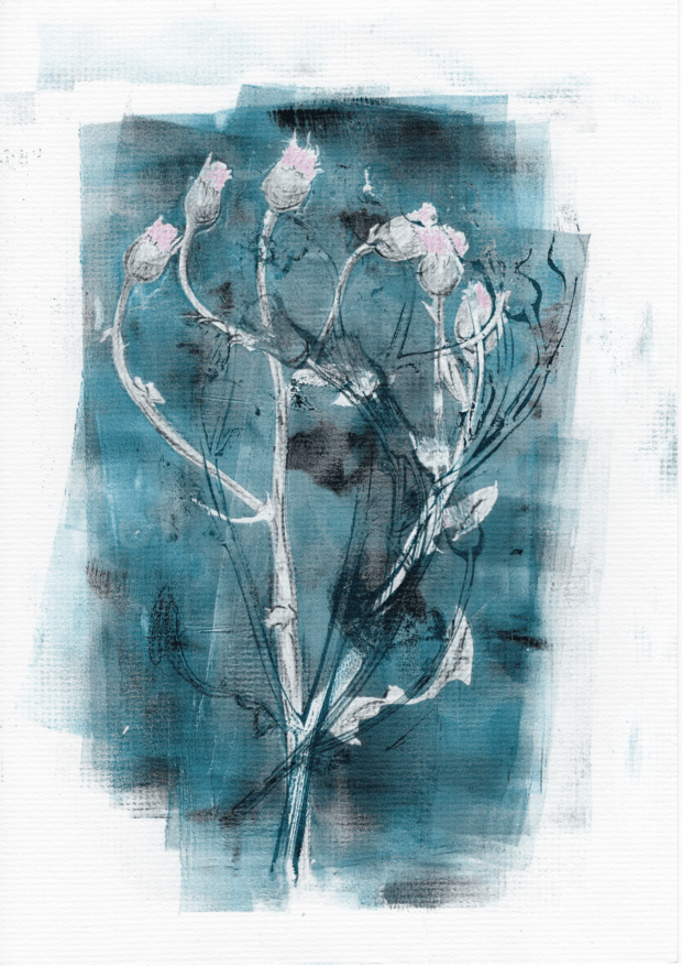
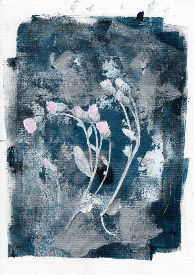
“The thistle has power”
Gel plate printing, 2022
“The thistle has power” originated from a tenacious plant that grows wherever it suits it at the moment and does not ask anyone for permission. It is also stubborn in gel printing – it allows itself to be shown, but each time differently: sometimes sharper, sometimes more diffuse, always uniquely, as if deciding for itself how it will appear. At the same time, it is never alone – there are other plants beside it, each with its own shape, rhythm, and character.
Read more…
What I like about gel printing is that I can’t fully control the outcome. The color, the plant, the pressure, and the next layer each do their part a little, and you can’t really get the exact same image twice.
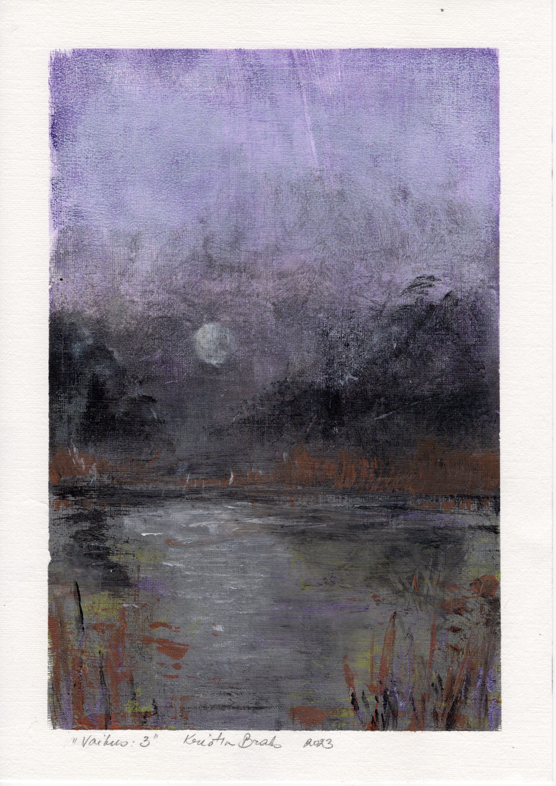
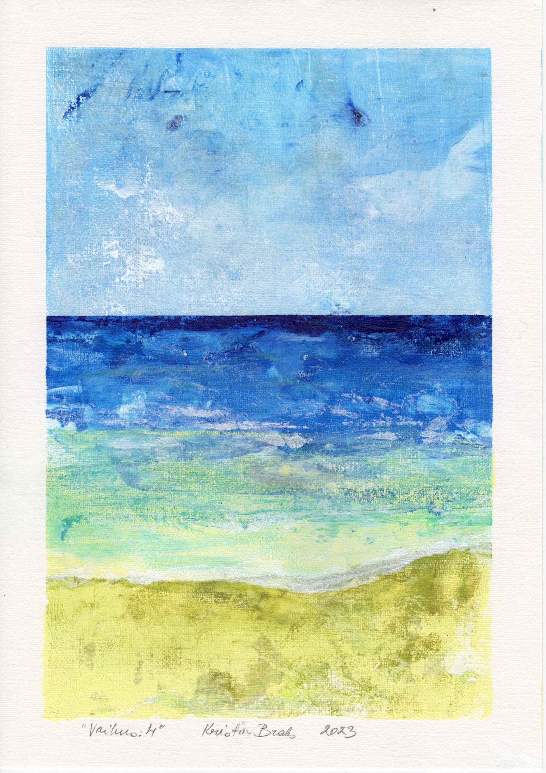
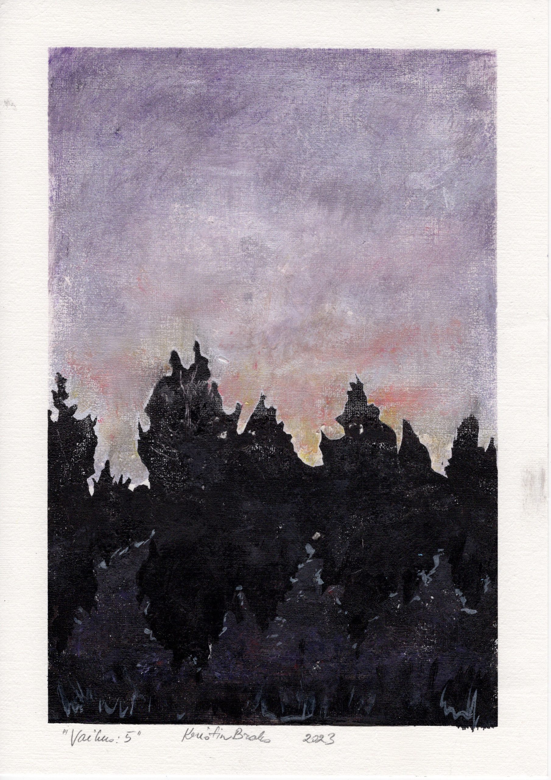
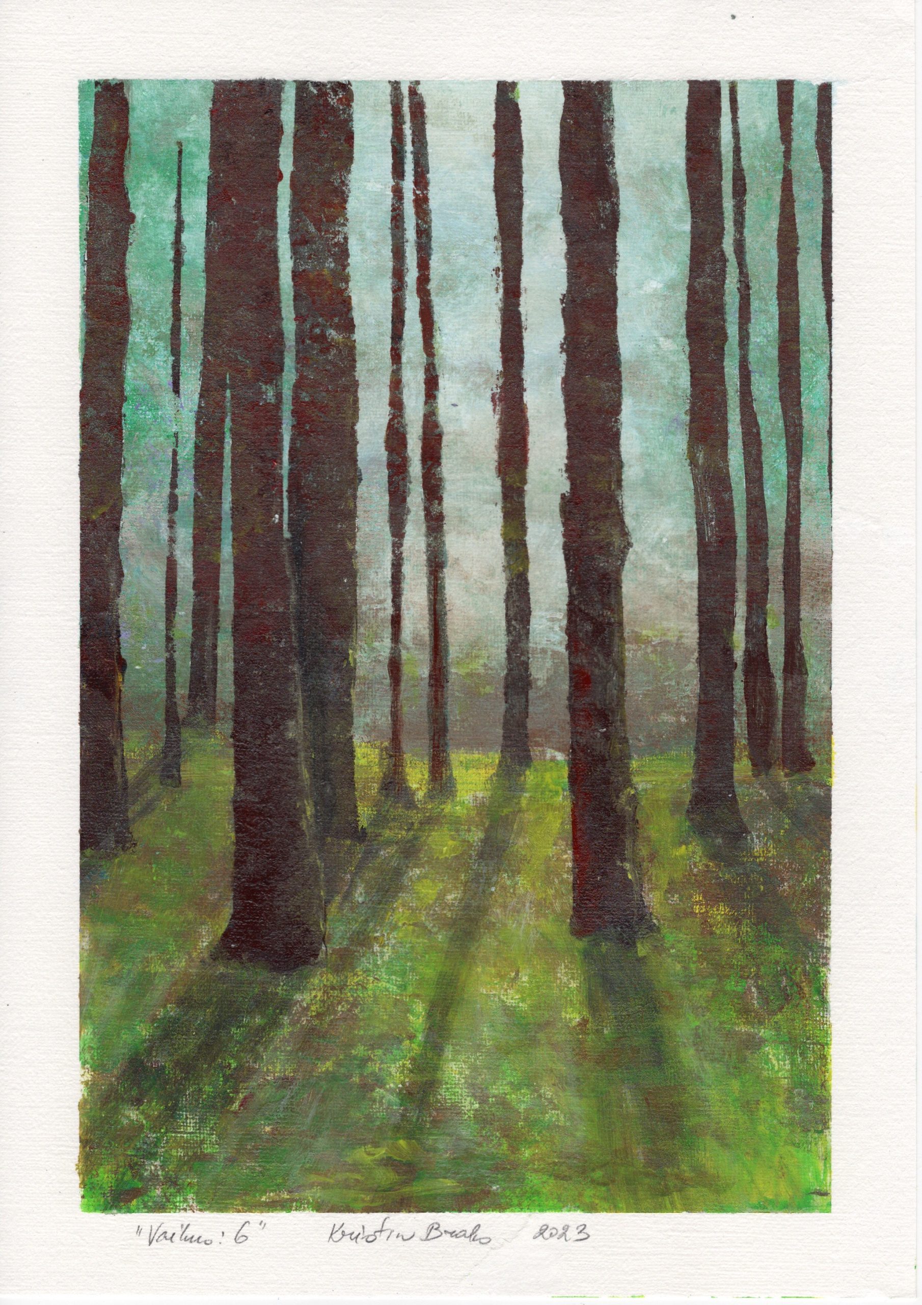
Technically, gel printing is a type of monotype: paint is applied to a soft gel plate, plants, stencils, or other materials that leave marks are placed on it, and the image is transferred onto paper. The works often develop in multiple layers, with parts of the earlier layers showing through beneath the subsequent ones.
It is also possible to make a gel plate at home using gelatin and glycerin.“Ohakal on vägi” and “Vaikus” were printed with a gel plate I made myself.
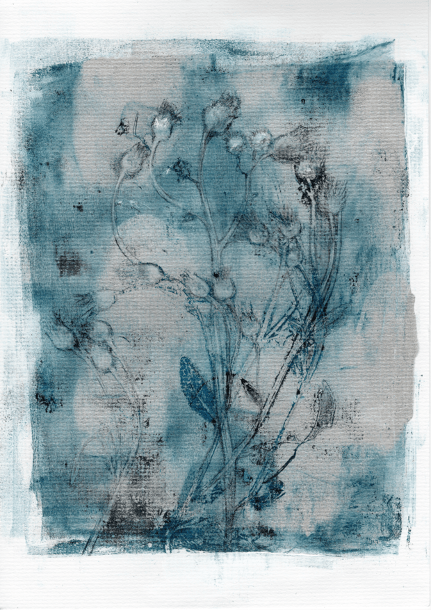
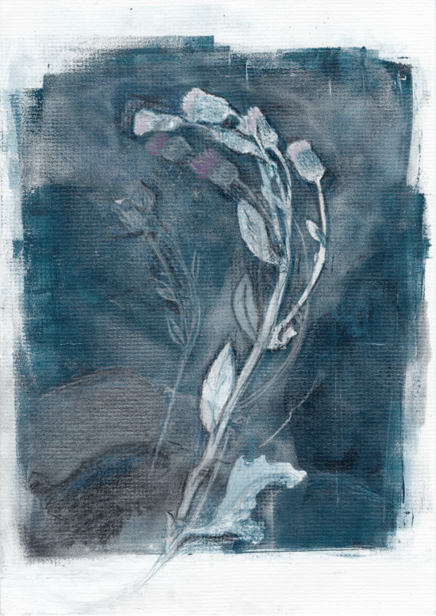

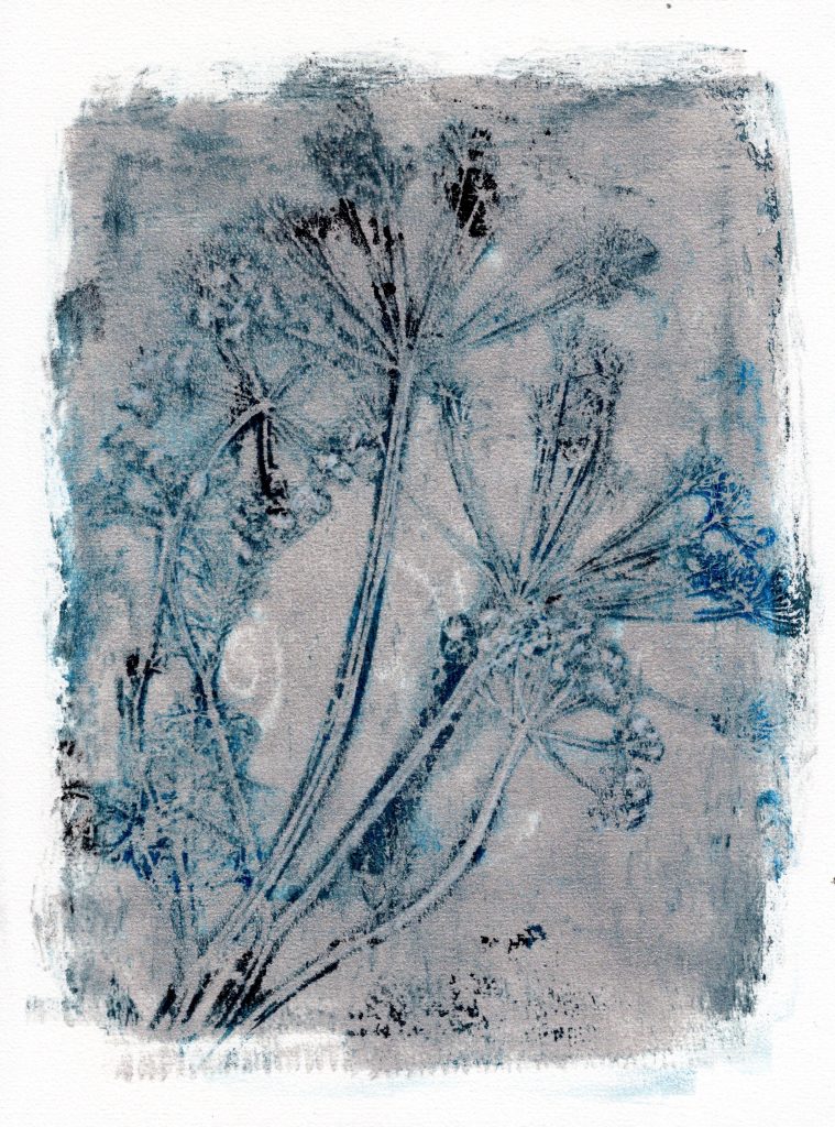
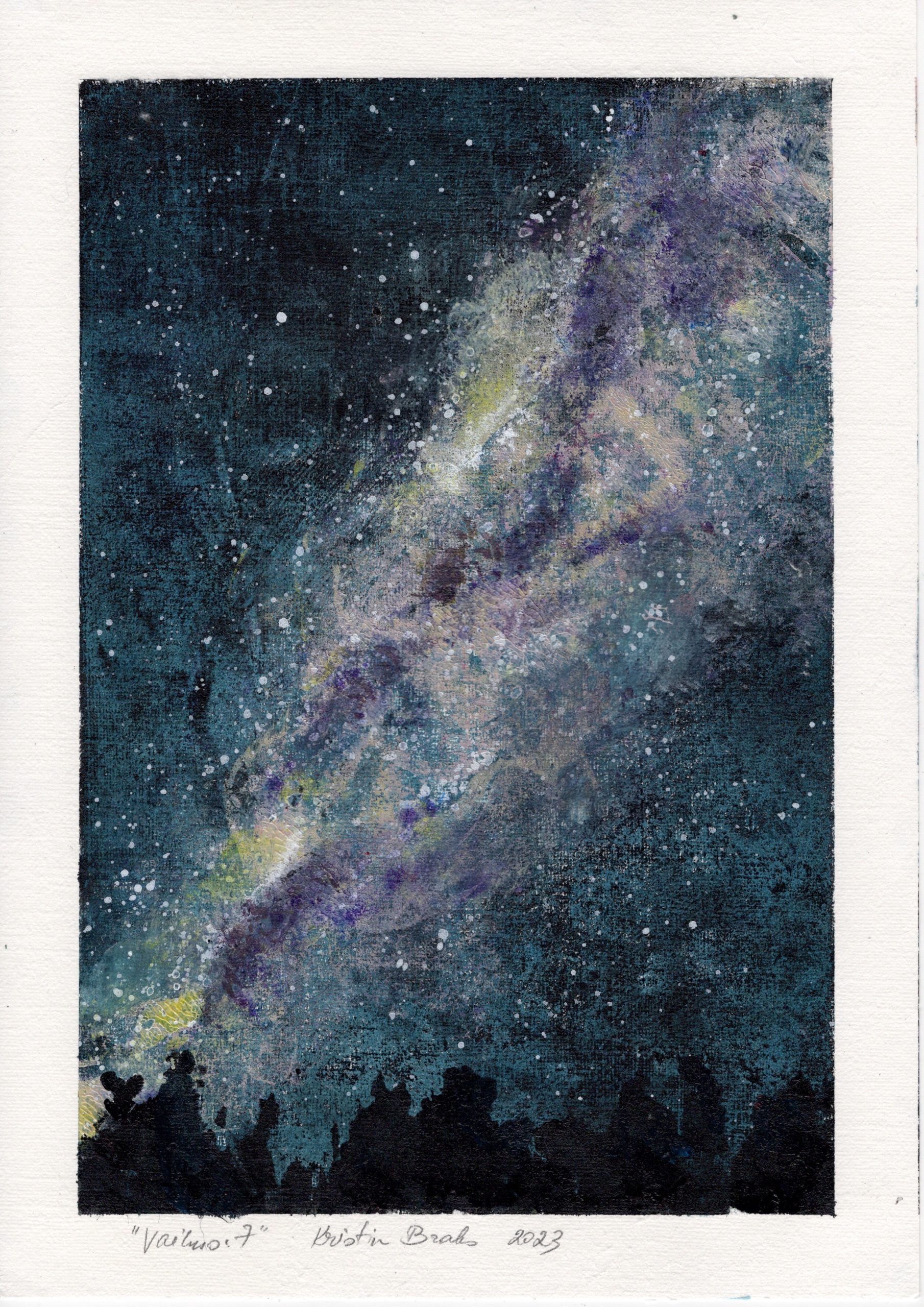
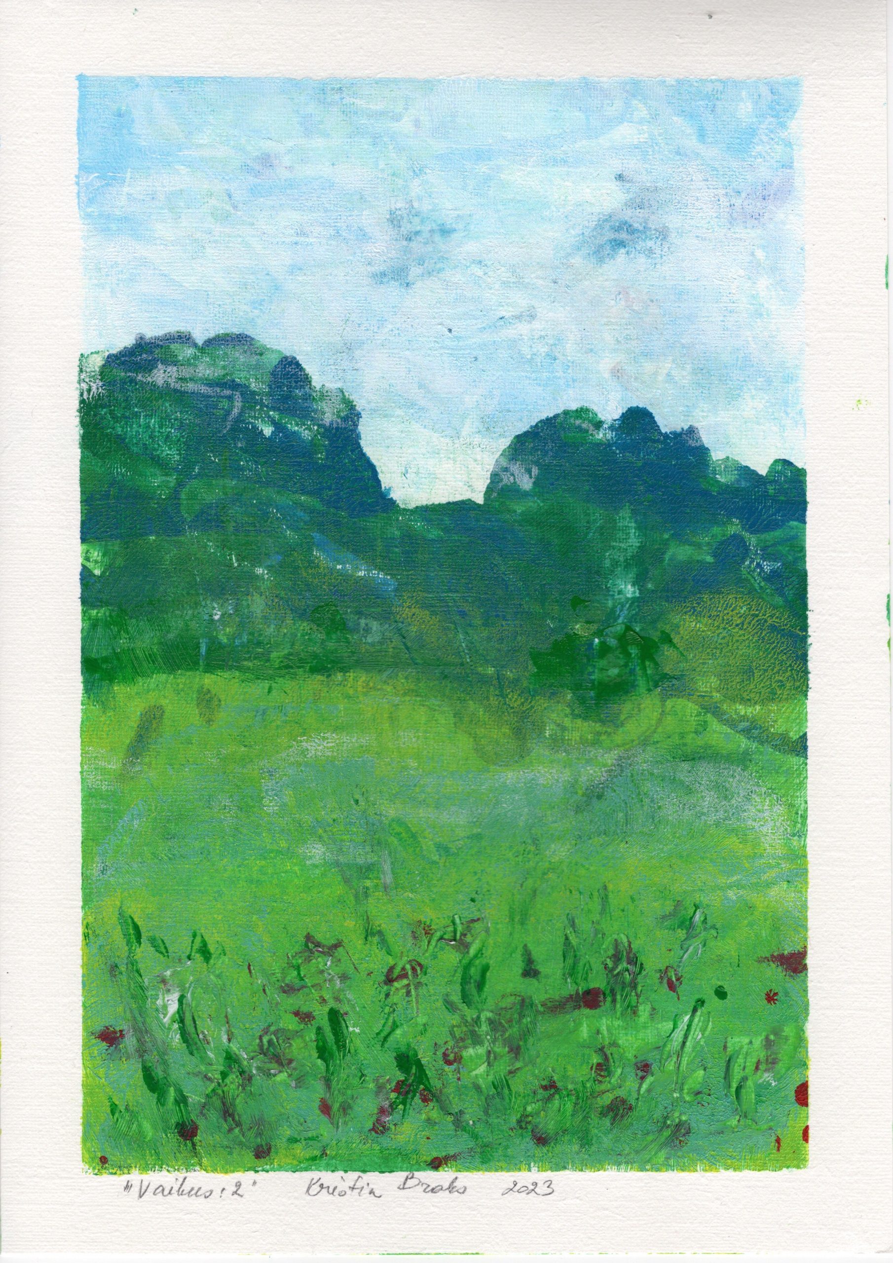
“Silence”
Monotype, 2023
Silence does not necessarily mean that nothing is happening. Sometimes there is simply more space for observation.
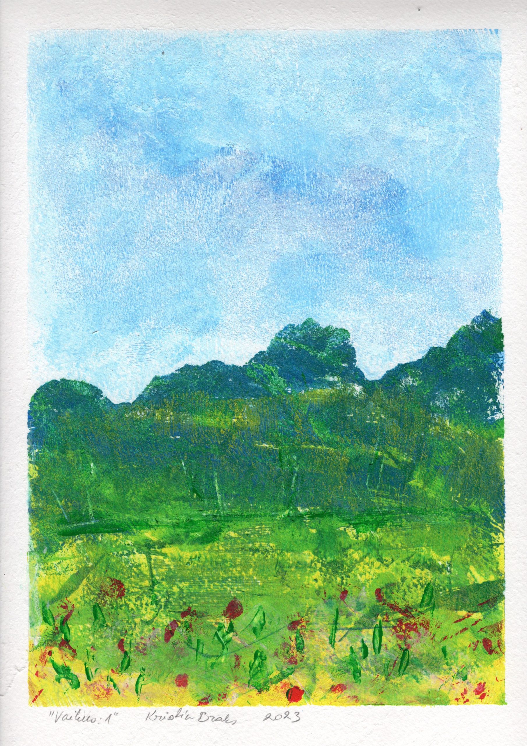
“In the Meadow”
2010-2024
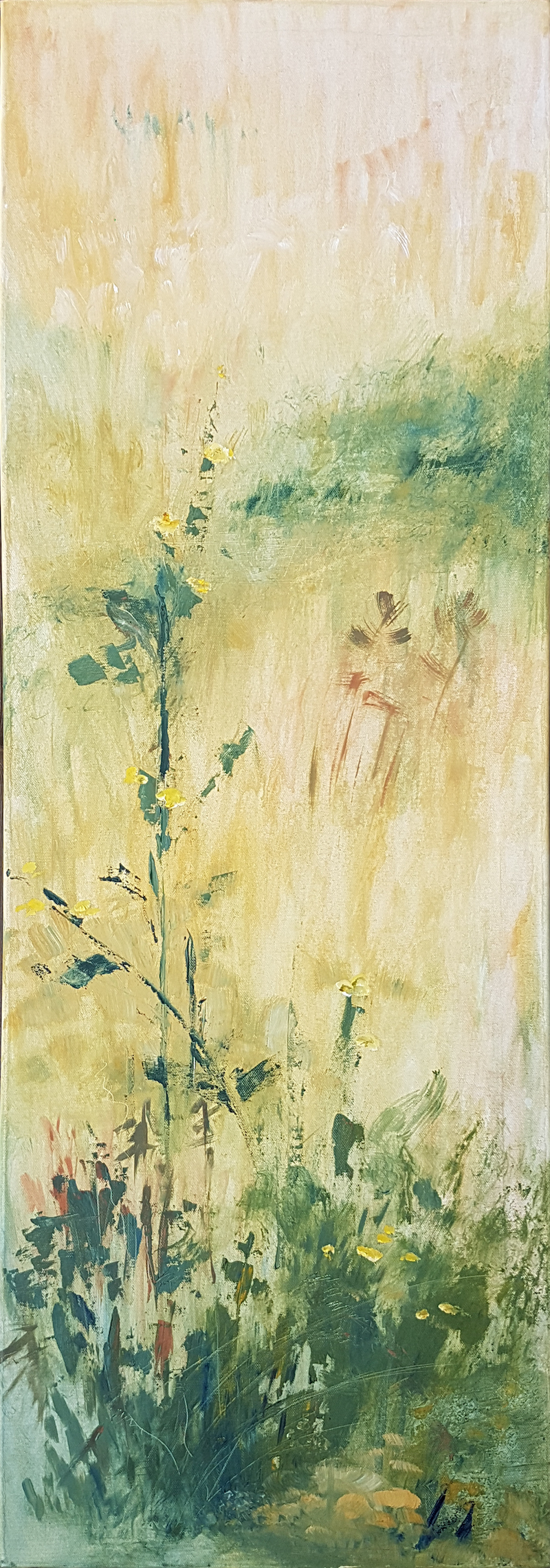
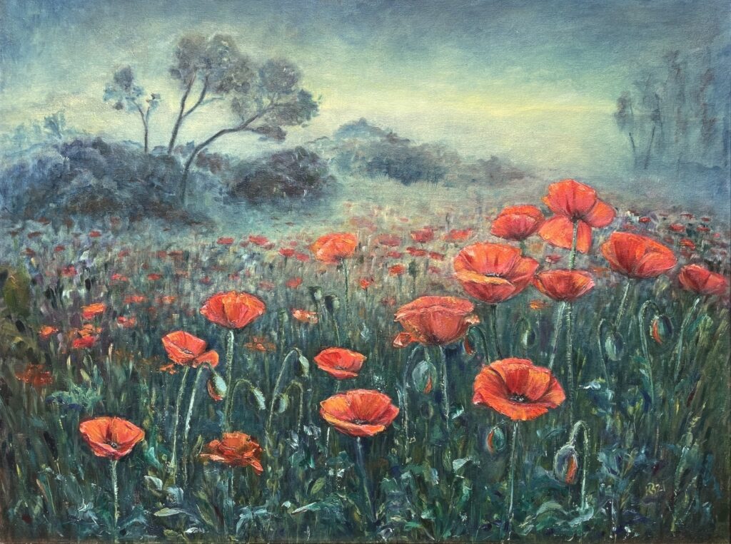
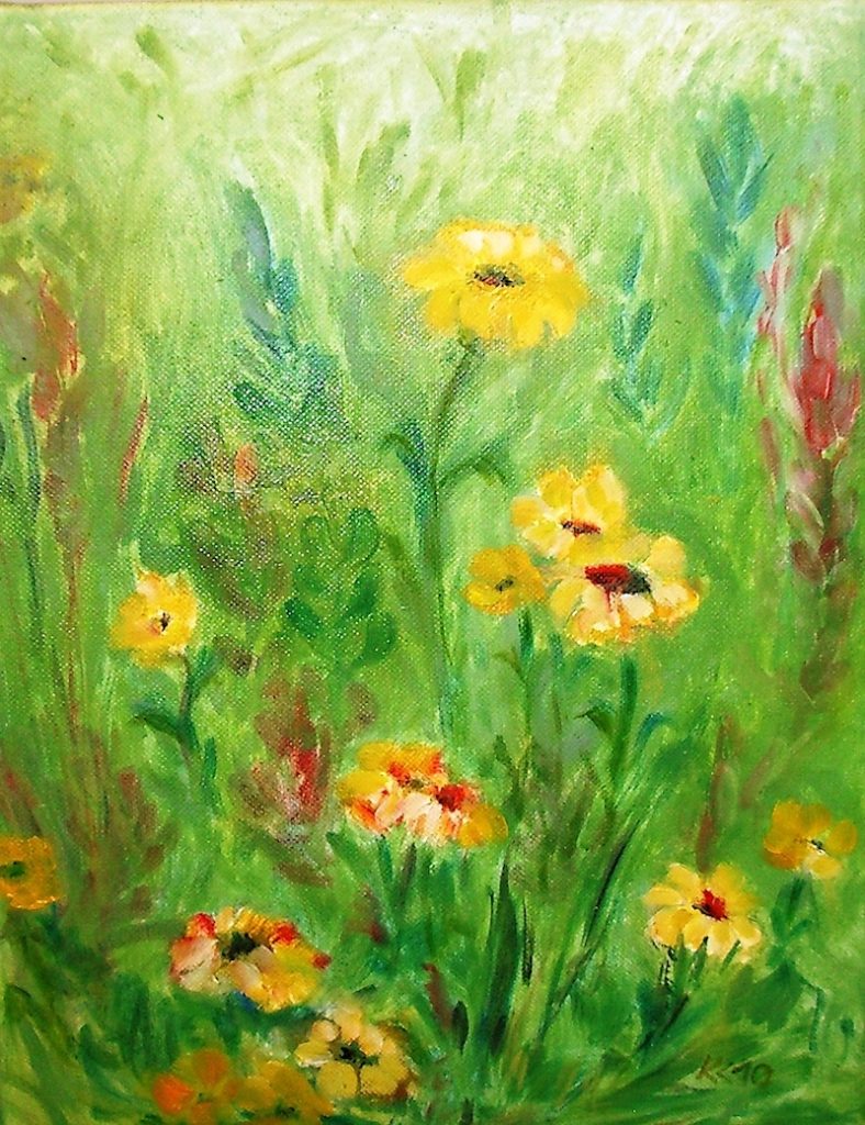
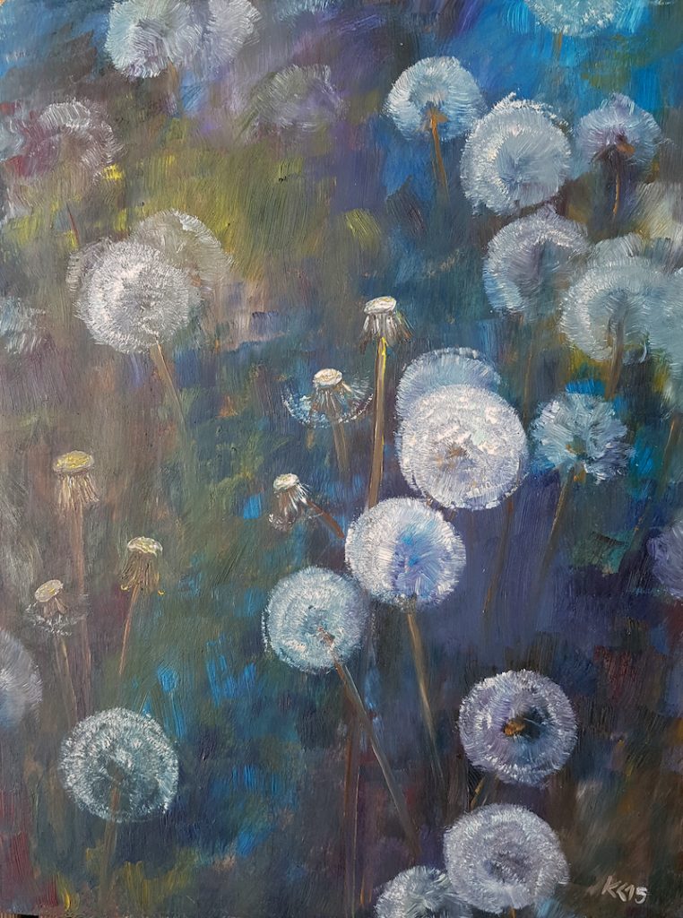
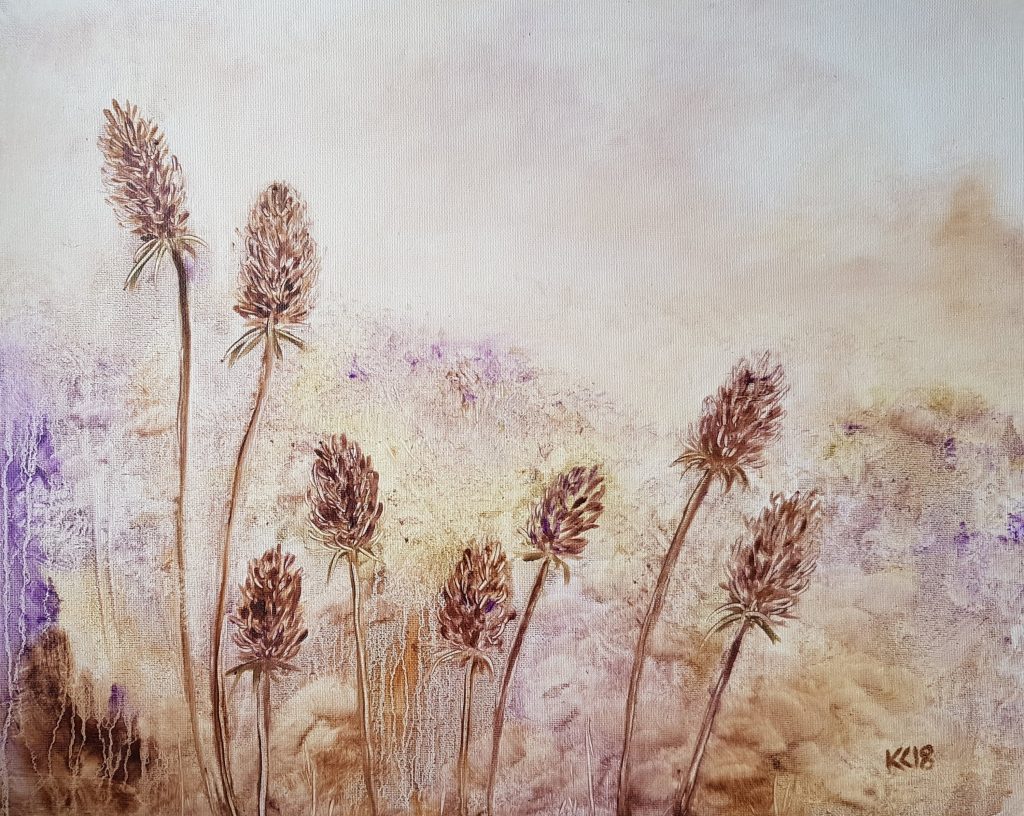
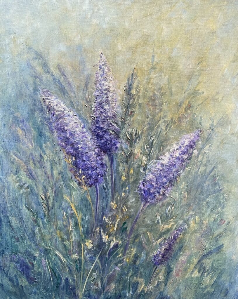
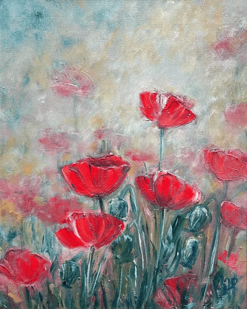
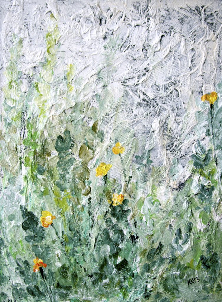
Natural meadows have something that is often missing in carefully maintained landscapes – a bit of chance, a bit of chaos, and a lot of life. I am captivated there by the changing light, plants, insects, fungi, and all those small details from which the idea for the next work can begin.
I don’t go to the meadow just to paint. I observe, take photos, and gather observations. Some plant, patch of light, or completely random encounter may later appear on the painting in a completely different form. Part of this visual notebook also makes its wayto Kakusalu’s Instagram..
Read more…
Looduslik niit on paljude taimede, putukate, lindude ja seente liikide elupaik. Niidud on eriti olulised tolmeldajatele, kuid nende mitmekesisus on sama oluline ka maastiku üldise tasakaalu jaoks.
Intensive farming, monocultures, and mowing too frequently make such habitats increasingly rare. Restoring meadows takes time, and sometimes nature conservation simply means not rushing to fix everything too quickly.
I also like this idea visually: a meadow is never truly finished. It is constantly changing, overgrowing, drying out, blooming again, and looks a little different each time.
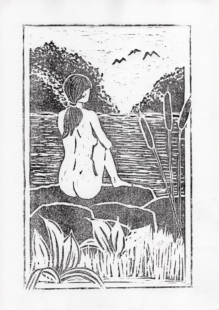
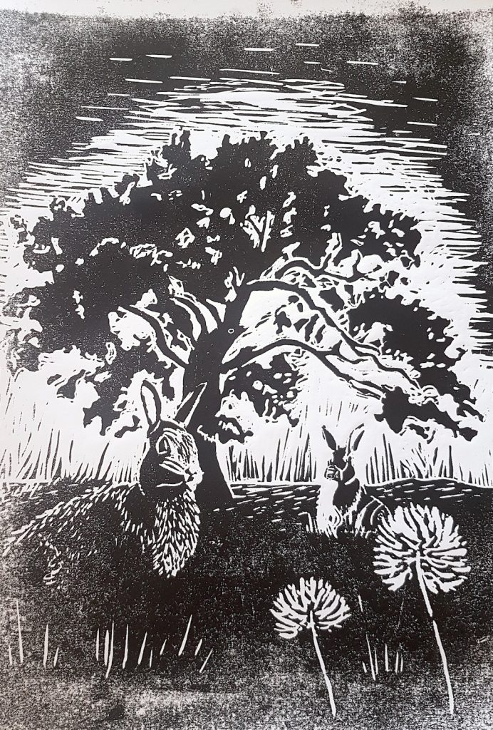
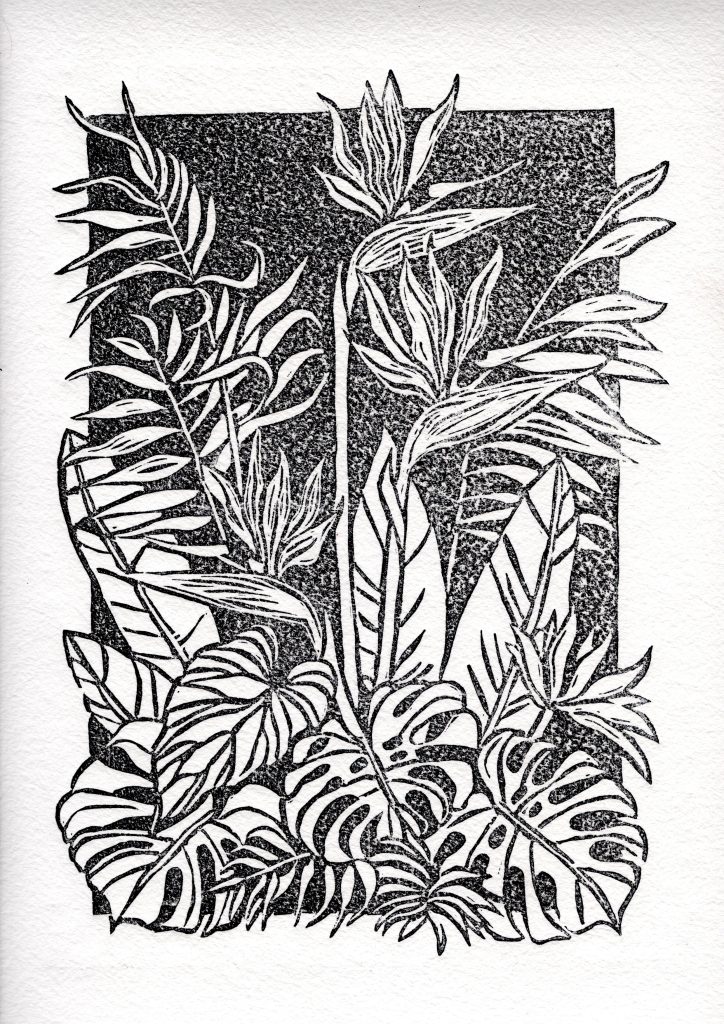
Linocut
2020 – …
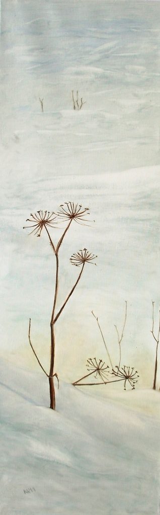
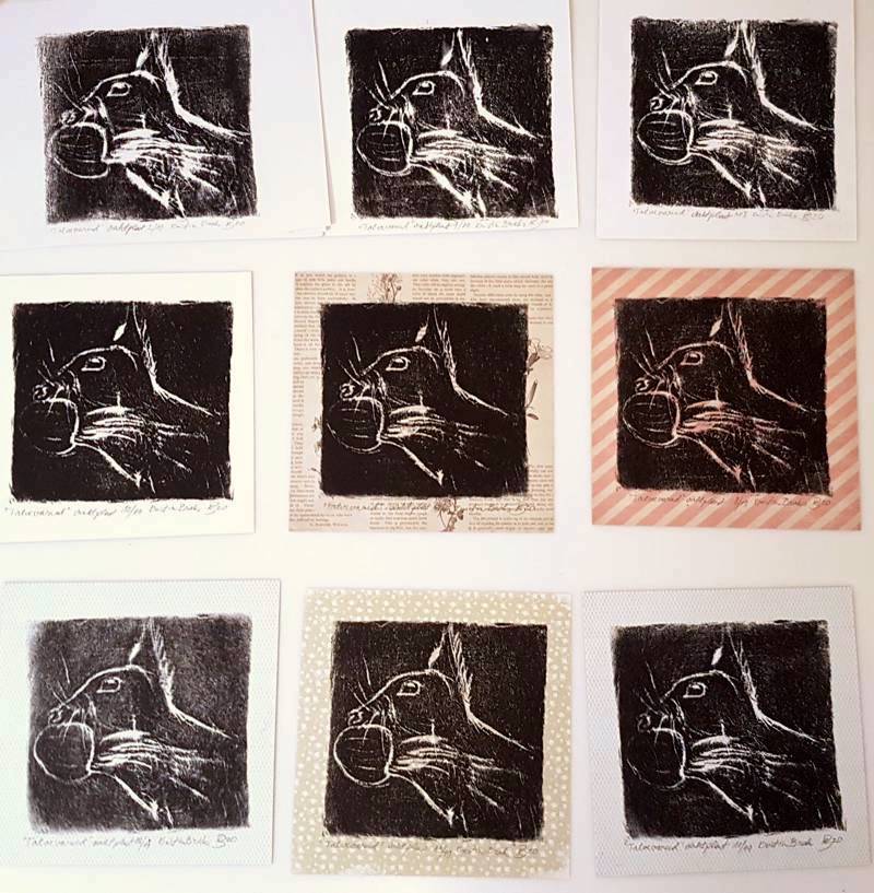
What I like about linocut printing is that the result is never quite predictable. The same image can have several lives – each print slightly different, depending on the ink, paper, pressure, and sometimes just chance. But first, the image has to be thought out in reverse, carved into the linoleum, and only then does it become clear what will actually appear on the paper. It is precisely this slow craftsmanship and a small dose of unpredictability that make linocut printing interesting to me.
Read more…
Linocut is a relief printing technique in which the image is carved into a matrix made of linoleum or a special printing plate. Ink is applied to the uncarved, raised surfaces, and the image is printed onto paper, cardboard, or fabric either by hand or with a press.
Since it prints the upper part of the matrix, the cut surface on the paper remains uncolored. The image is created as a mirror image on the matrix, and each print may vary slightly depending on the amount of ink, material, and pressure.
Experimental graphics
2020
Cyanotype + screen printing = excellent result
Sometimes I just attend art courses for my own enjoyment, which give my work a fresh perspective. This time, the opportunity arose to combine fast, playful, and experimental graphic techniques.
I’m not quite sure if cyanotype is my technique, but it definitely added a new possibility to my toolbox – and you can get a proper blue with it.
One of my earlier sketches got a new life as the work “Yin & Yang.”
More pictures from the course, including my works, can be foundin the Estonian Academy of Arts course gallery.
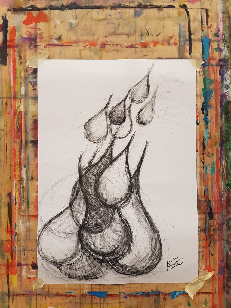
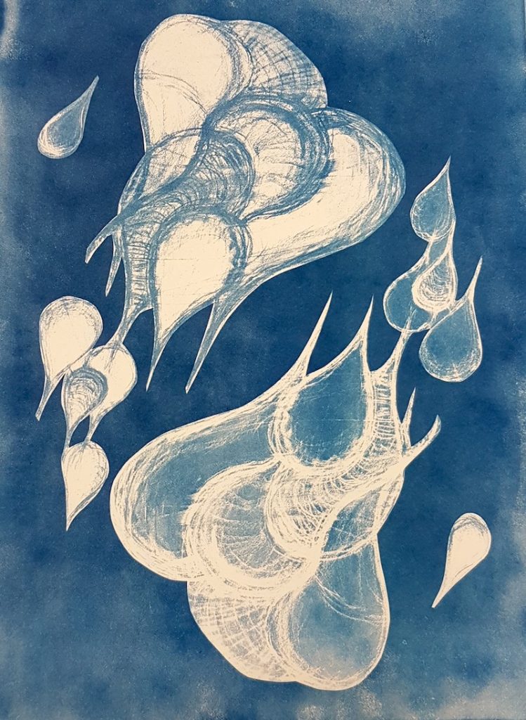
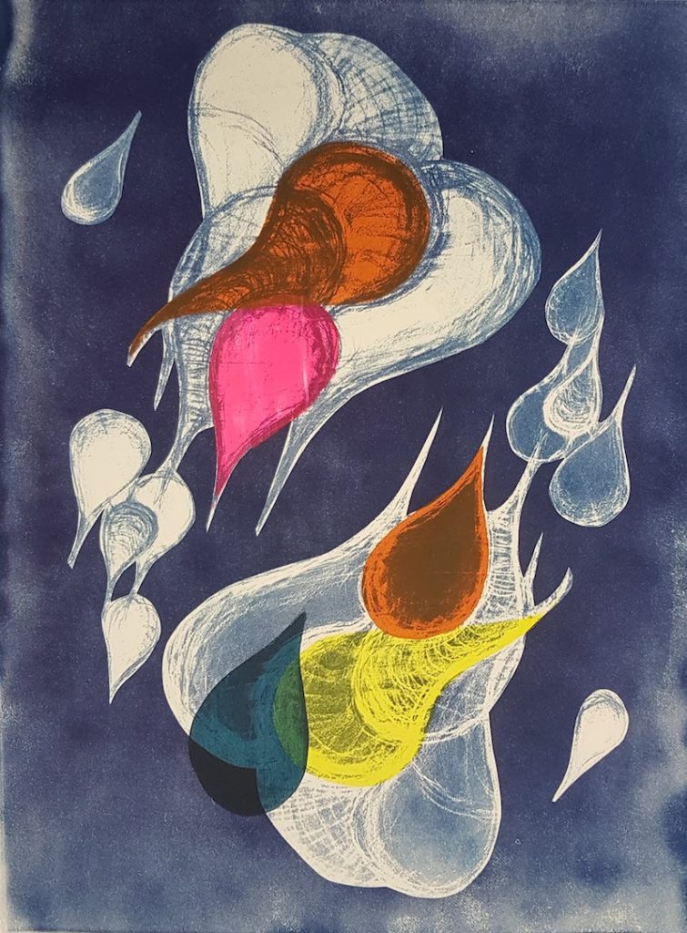
Yin & Yang, charcoal drawing, cyanotype, silkscreen printing, 2020
Read more…
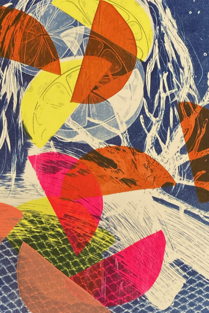
Experimentation, cyanotype and silk screen printing, 2020
“Form is norm”
2019
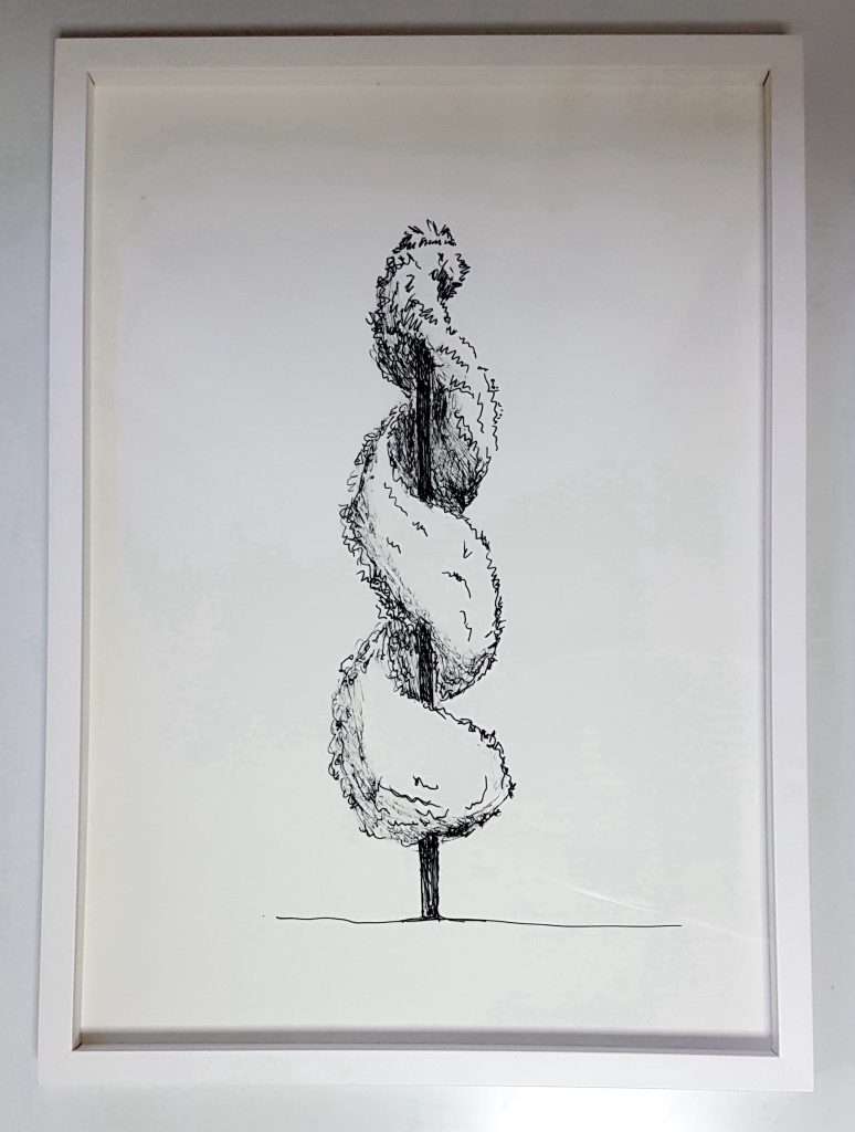
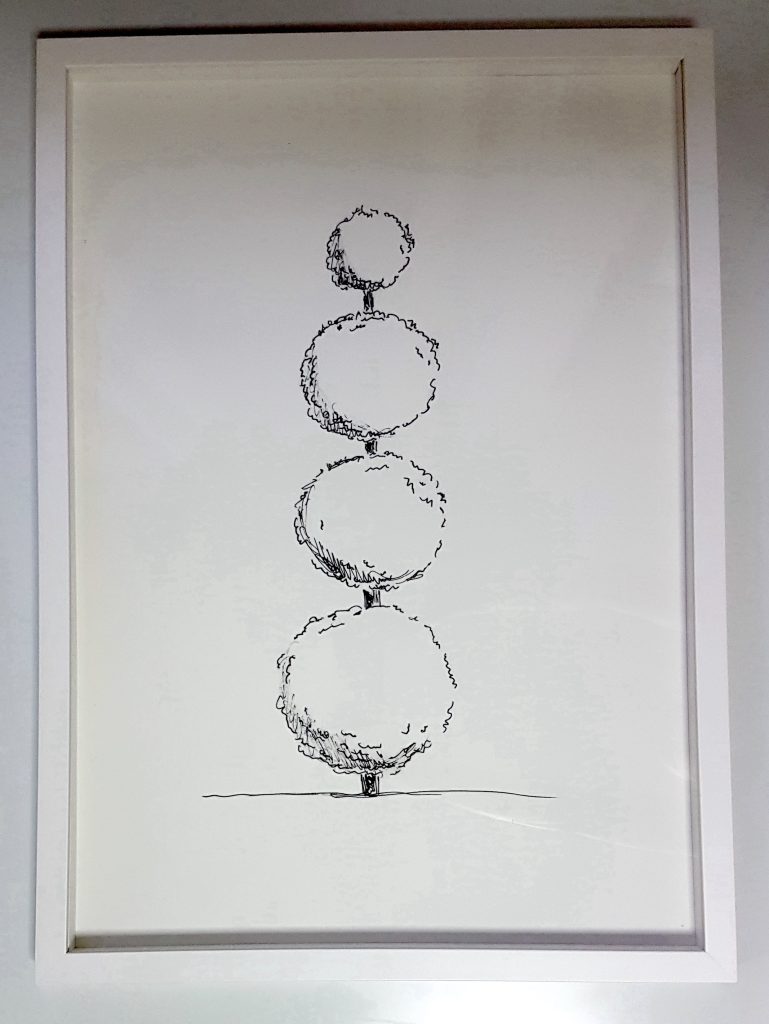
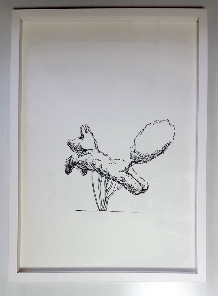
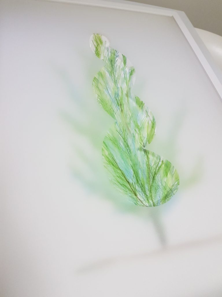
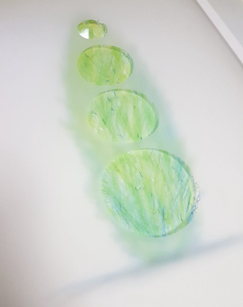
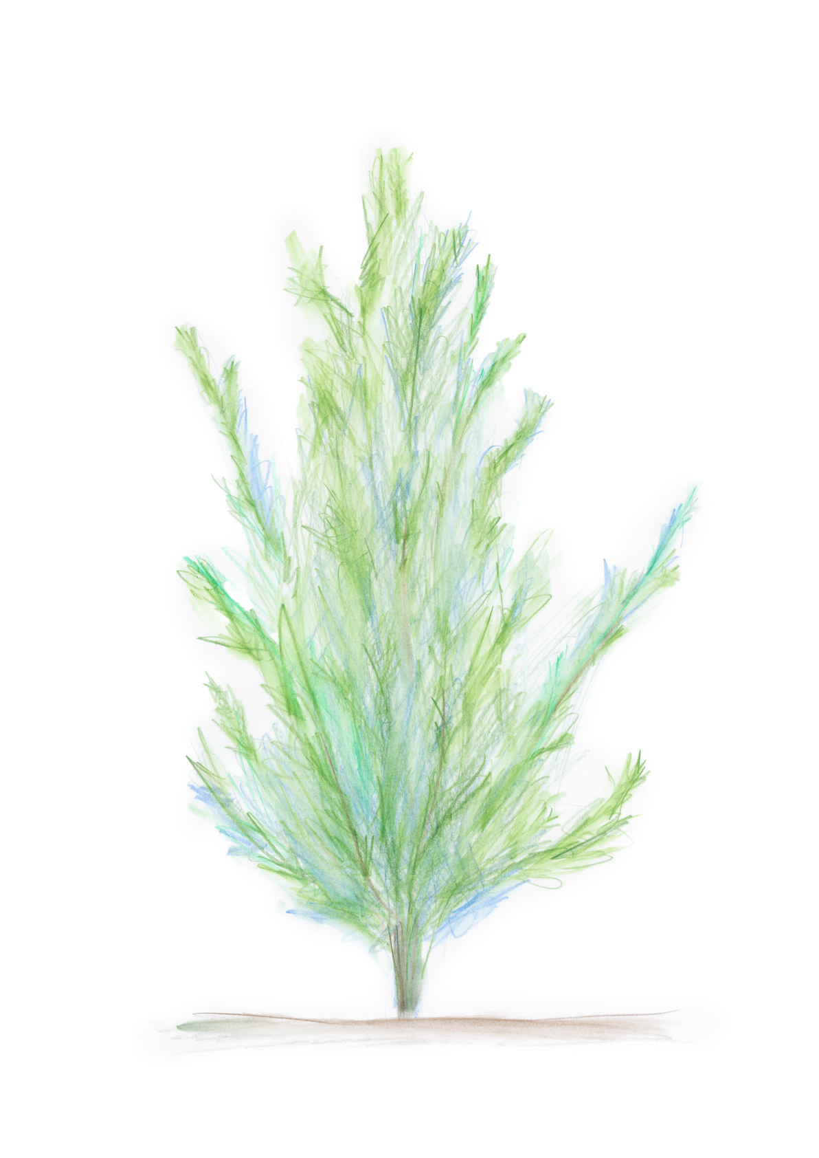
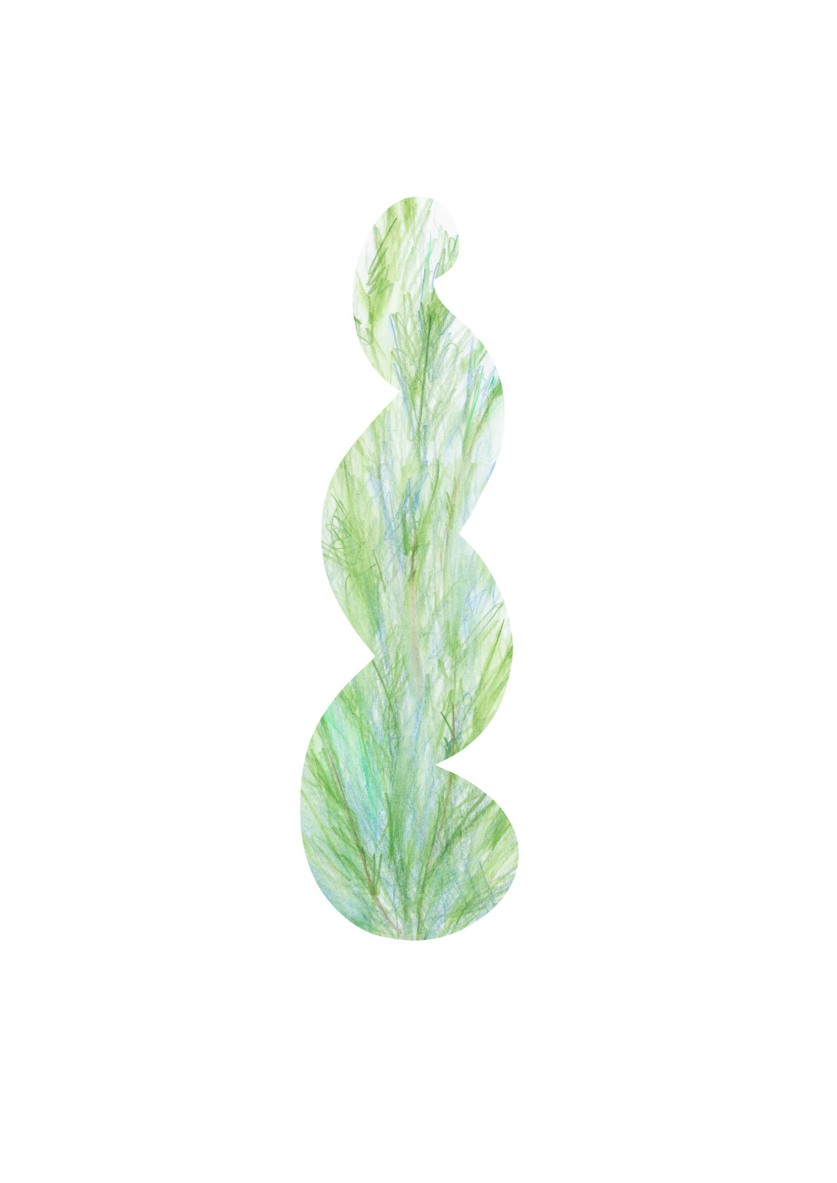
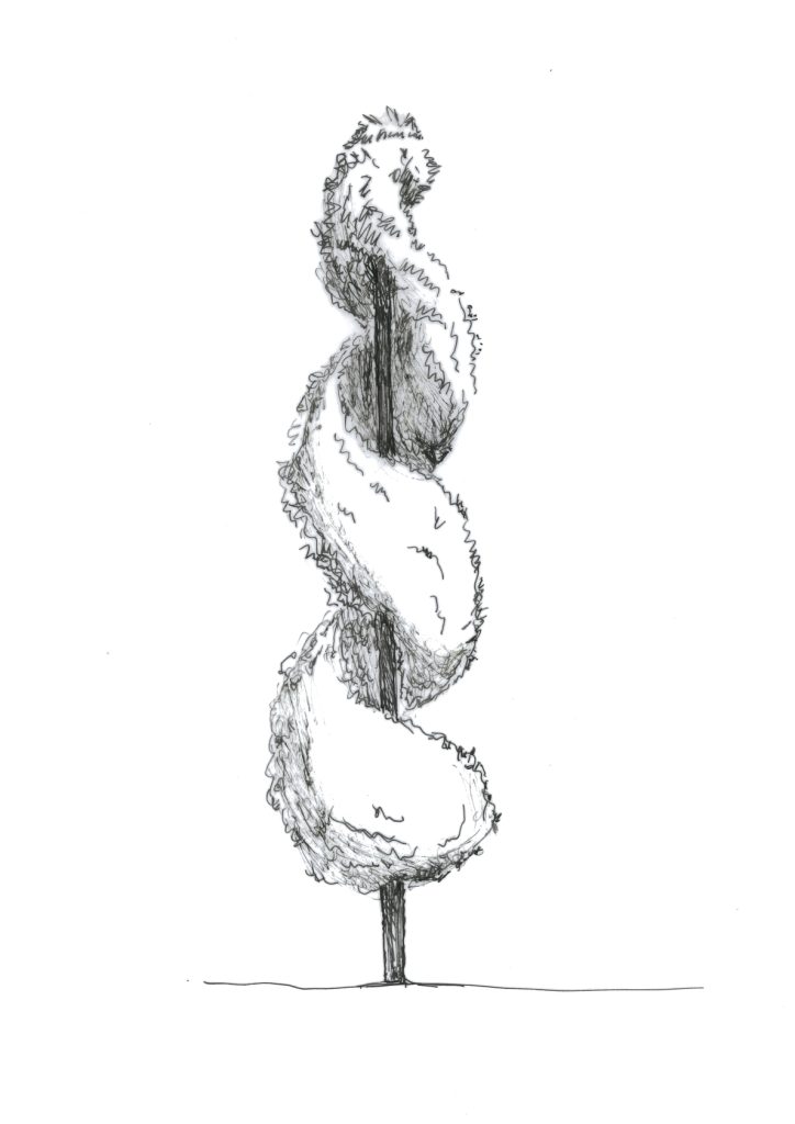
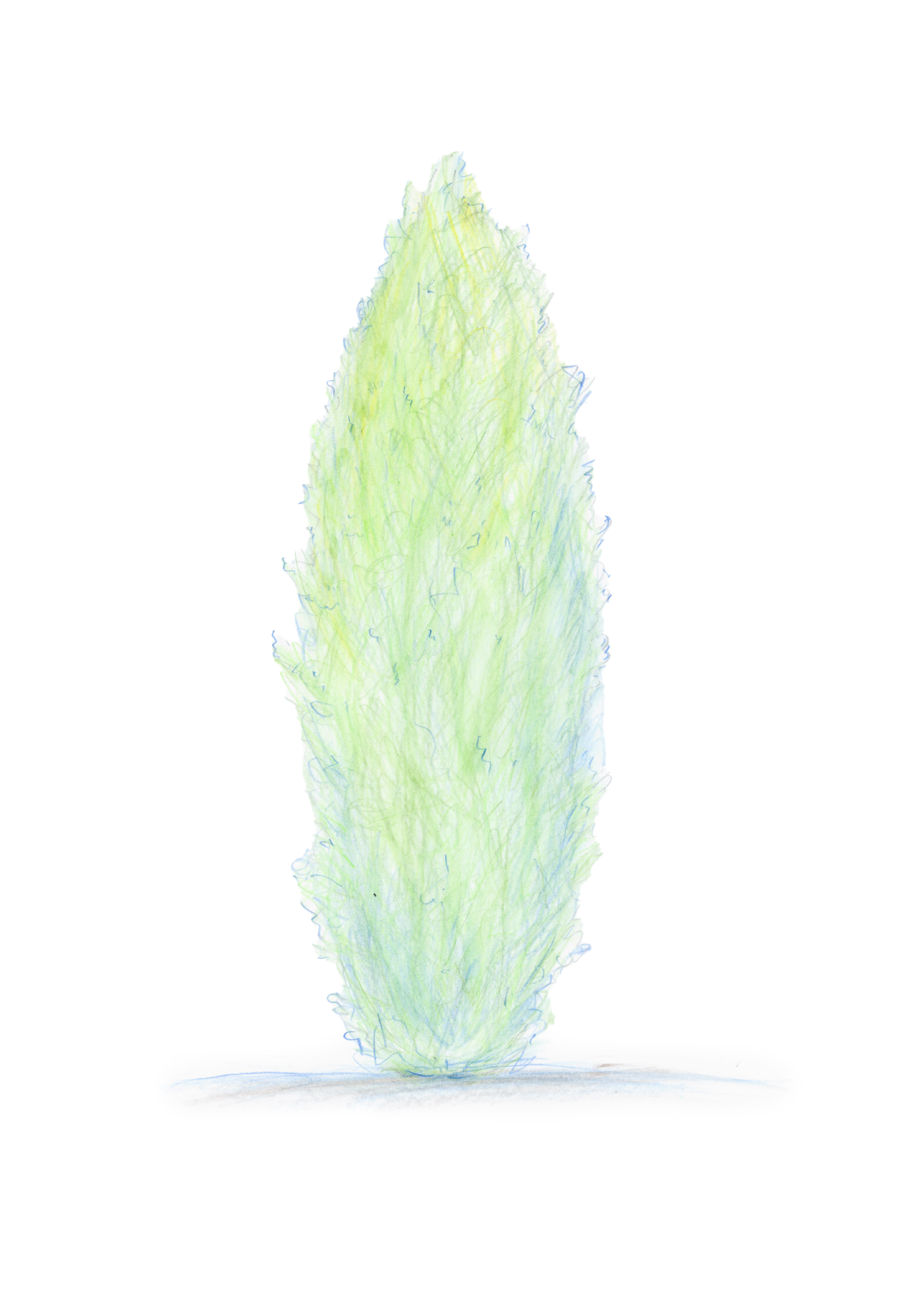
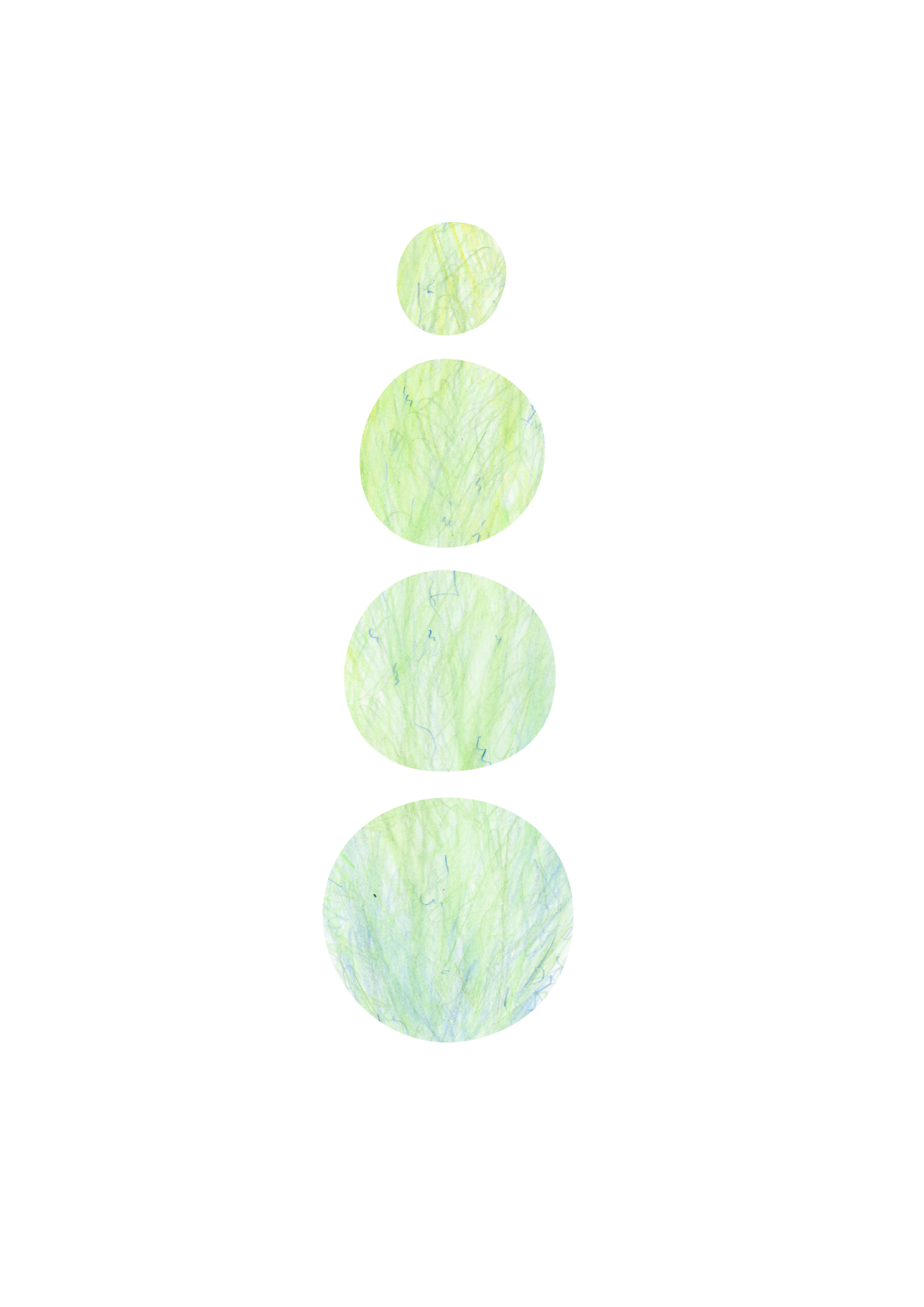
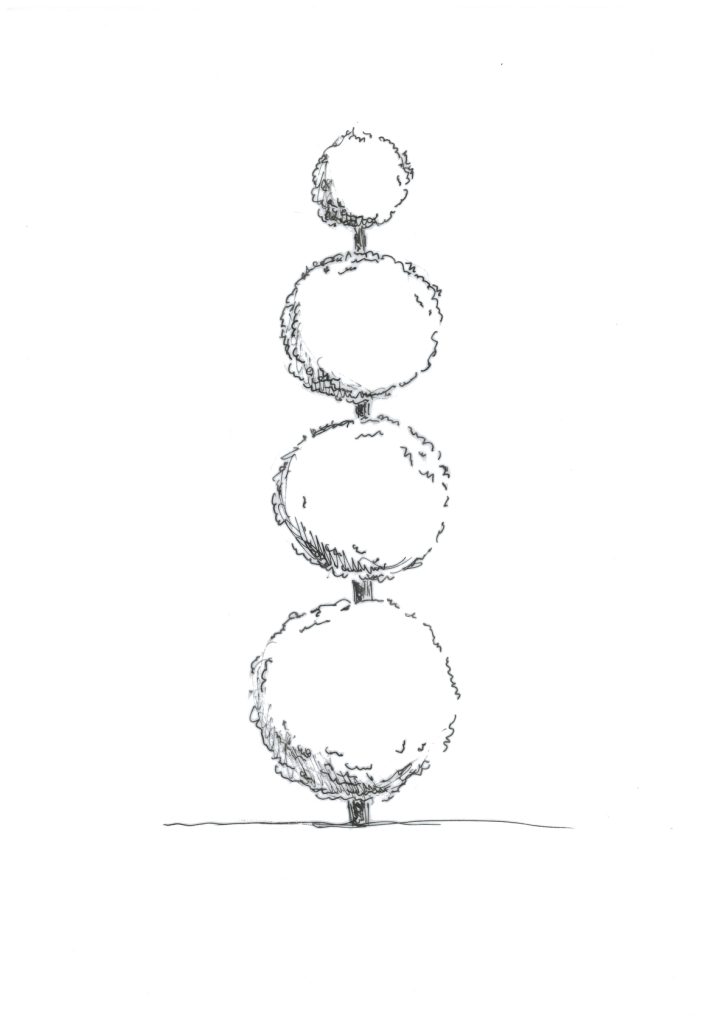
The inspiration for the work came from ornamental horticulture, which raised an aesthetic question about what is considered beautiful – a fertilized and pruned decorative plant or a tree growing in an unrestricted environment? The form of the same species can vary significantly depending on the purpose; it all depends on what we expect from the shoot and where it grows. The originality and diversity inherent in nature are evident in every individual, with the environment determining the form.
Is the form a norm?
Read more…
The work carries within itself the existential question of essence and appearance, which arose through the interpretation of education and upbringing. Every unique individual is in interaction with the environment.
Which one affects which?
Coping with changes in form is an adaptation to the environment. The advantage of humans is the freedom to choose between form and formlessness, to change form, or to switch to a standardized environment.
Is this normal?
Is reality what appears to the viewer, or is it what the viewer is allowed to see? Is everything immediately visible on the surface, or is there something hidden? How does the environment affect the observer or the observed? What kind of person does school shape us into, and what norms must we consider in life? Is form a norm? What does society consider normal, and where should the boundary be drawn in aesthetics? Should one follow socially approved customs, or is the wild nature and self-growth more enchanting?
Look and you will see further!
Graphic exhibition:
At Tallinn University’s Tallinn Gallery (05.2019 – 09.2019)
At Tallinn University’s café “Oaas” (10.2019 – 05.2021)
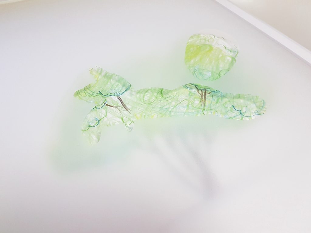
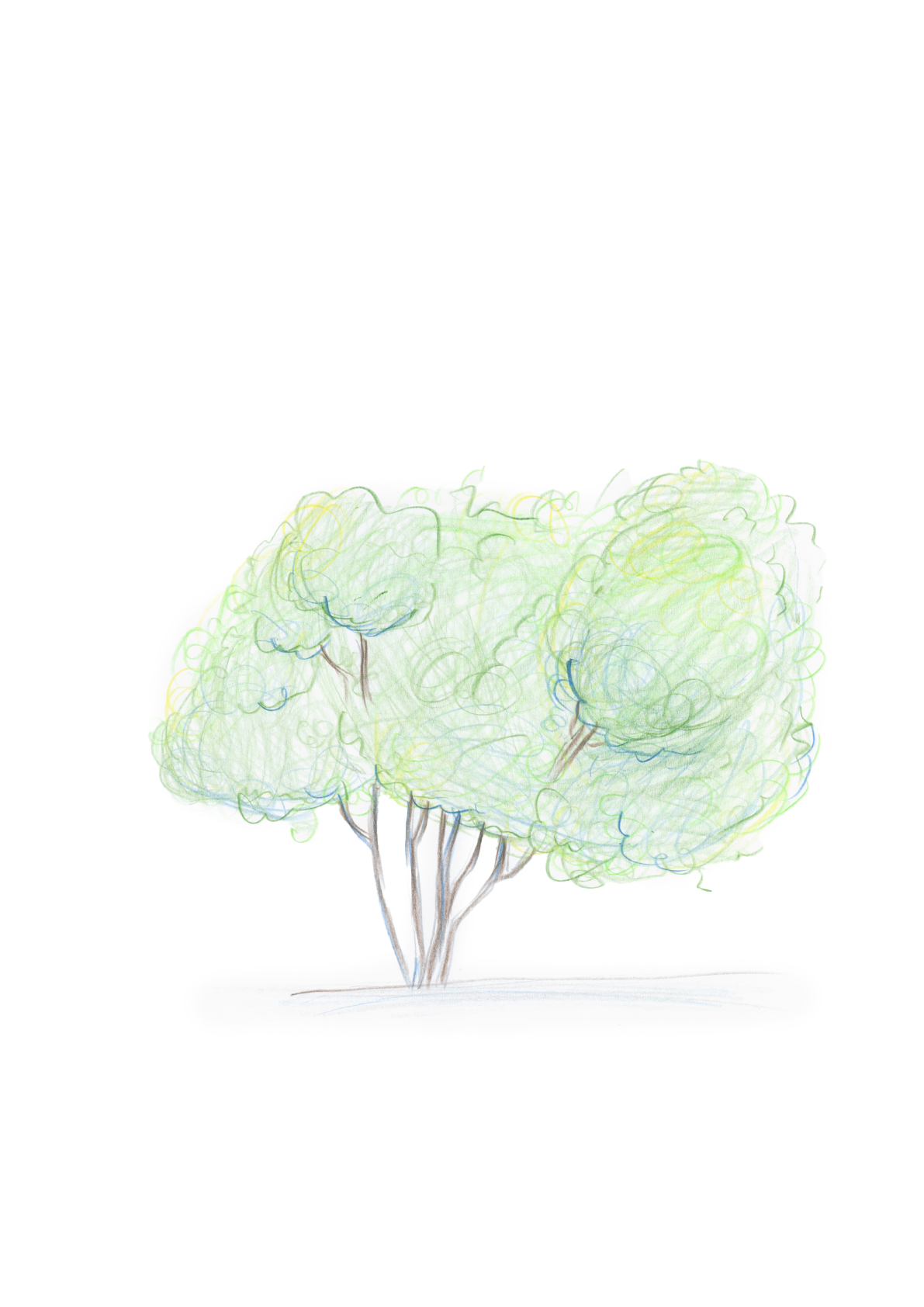
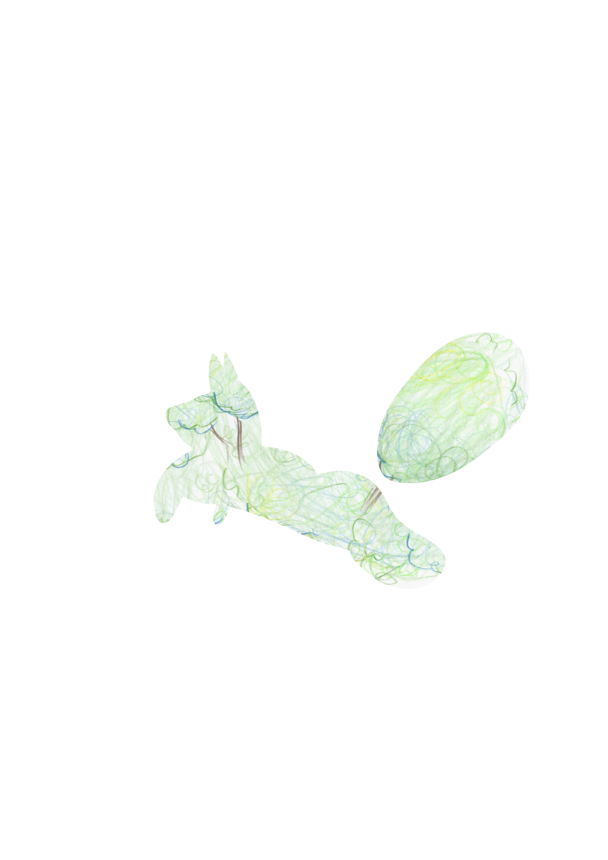
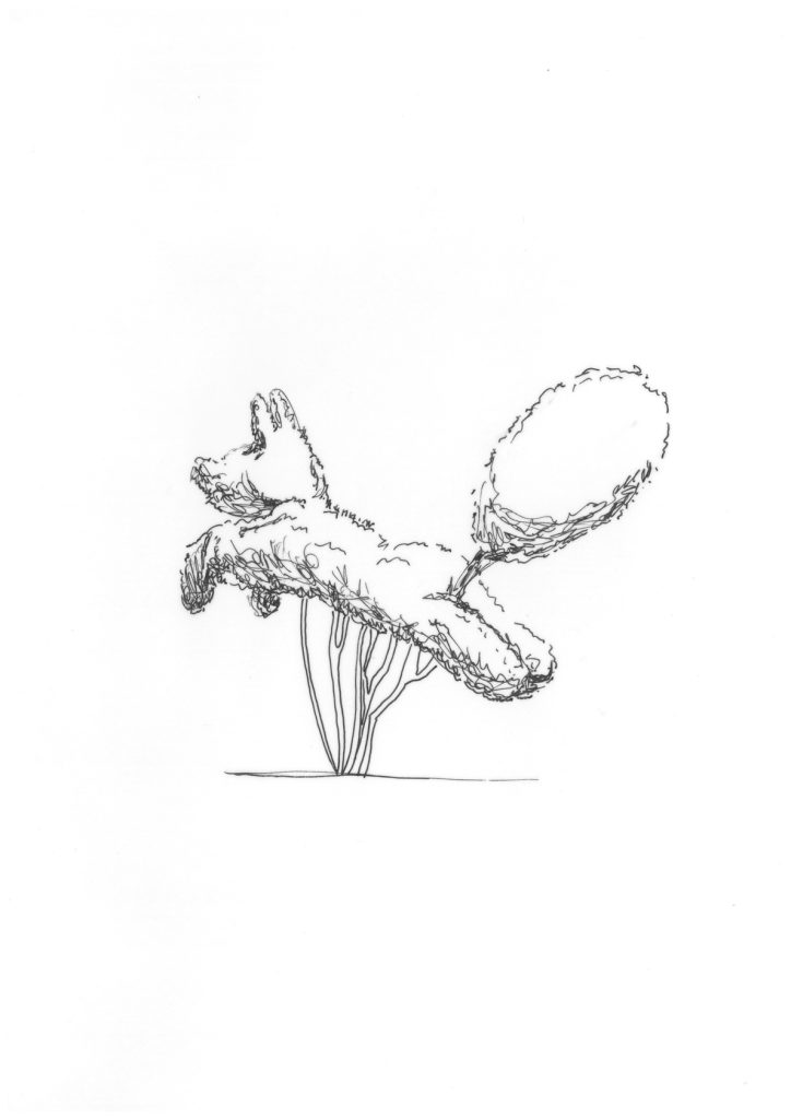
See more…
Kadriorg Park Discovery Trail Worksheet
Kadriorg Park is a place where you can simply go for a walk – but if you start to look a little more attentively, there is much more to discover there.
The “Kadriorg Park Discovery Trail 24/7” was created as educational material that guides you to notice the park’s nature, history, and details. It can be used independently while walking in the park or as an aid for outdoor learning.
The material was created in collaboration with the Kadriorg Art Museum and Kadriorg Park, supported by the Estonian National Culture Foundation.
The PDF is available in Estonian, English, and Russian. Download the Estonian versionFrom the Estonian Art Museum’s websiteor the English version here:
Packaging design
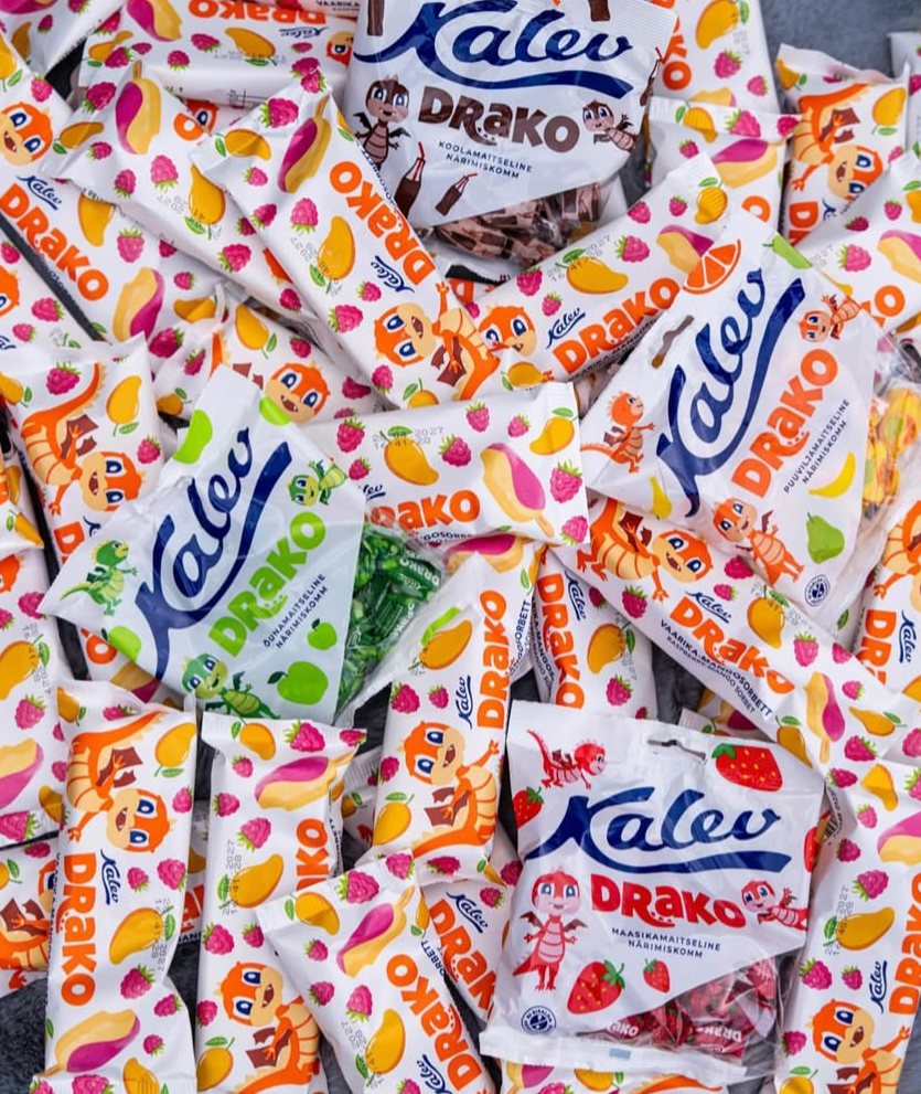
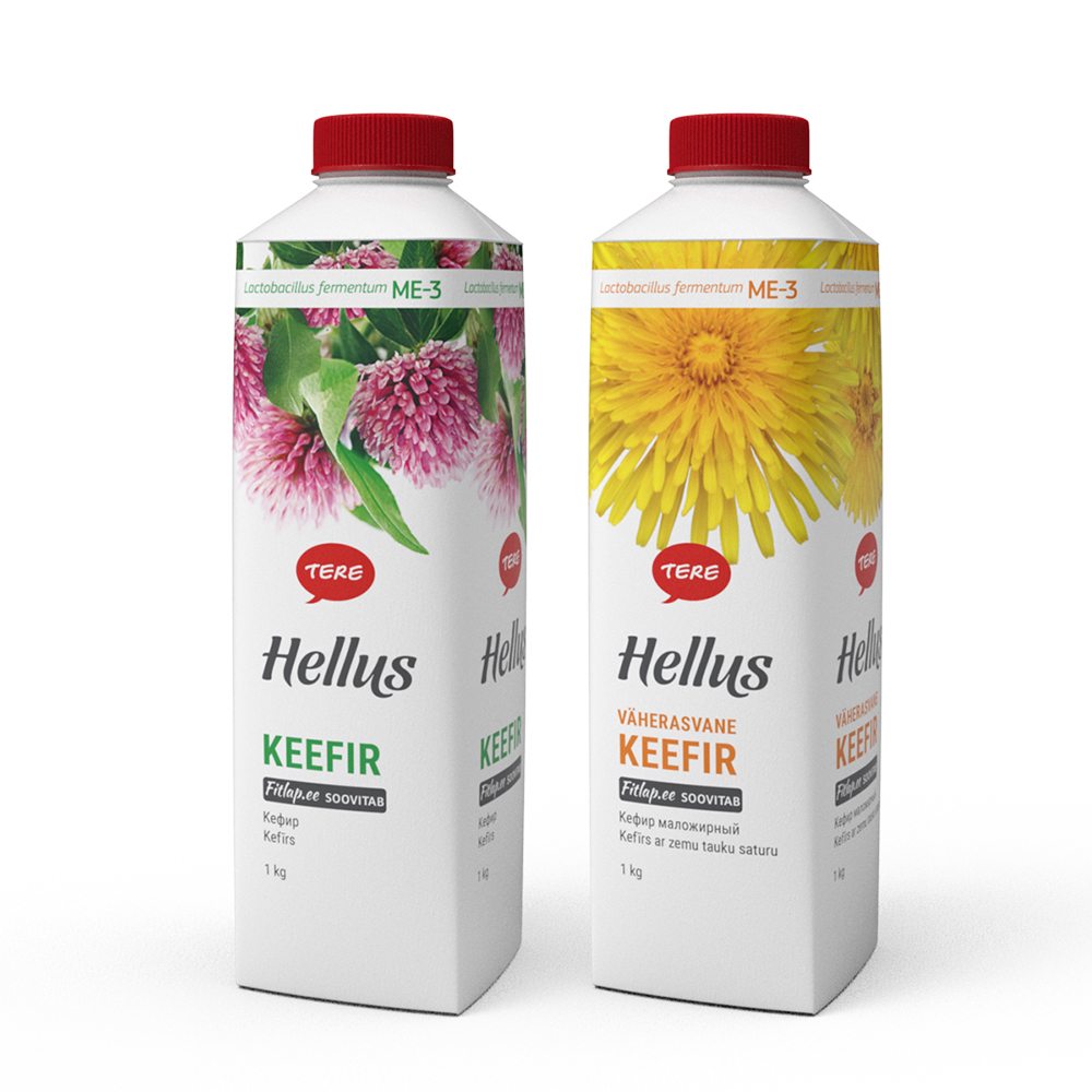
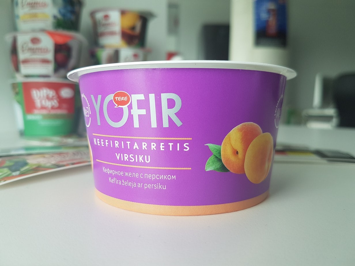
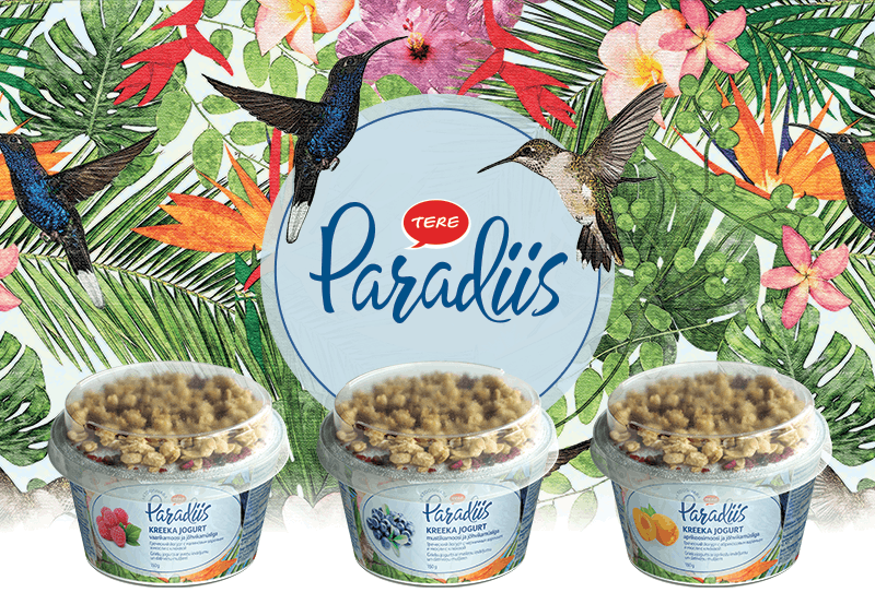
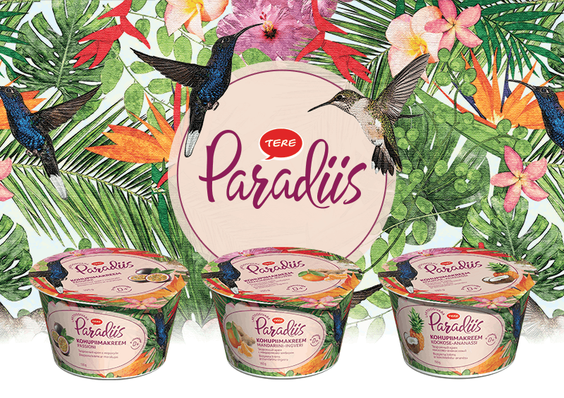
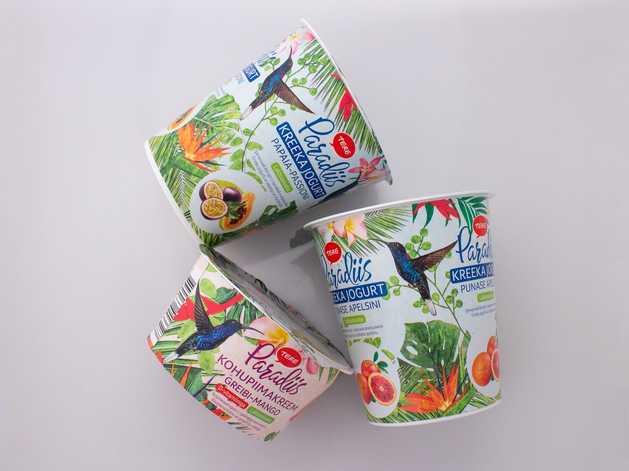
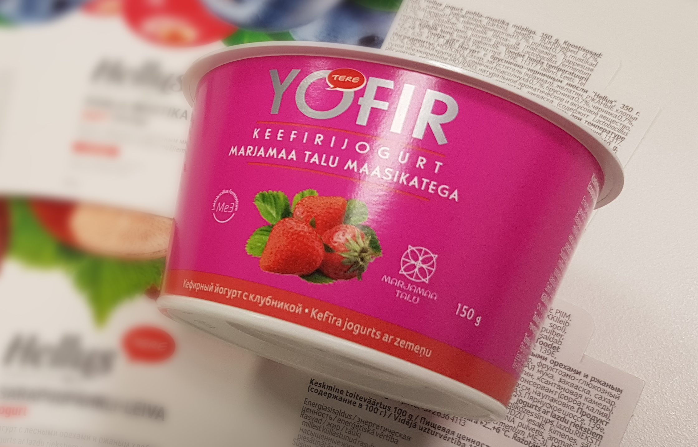
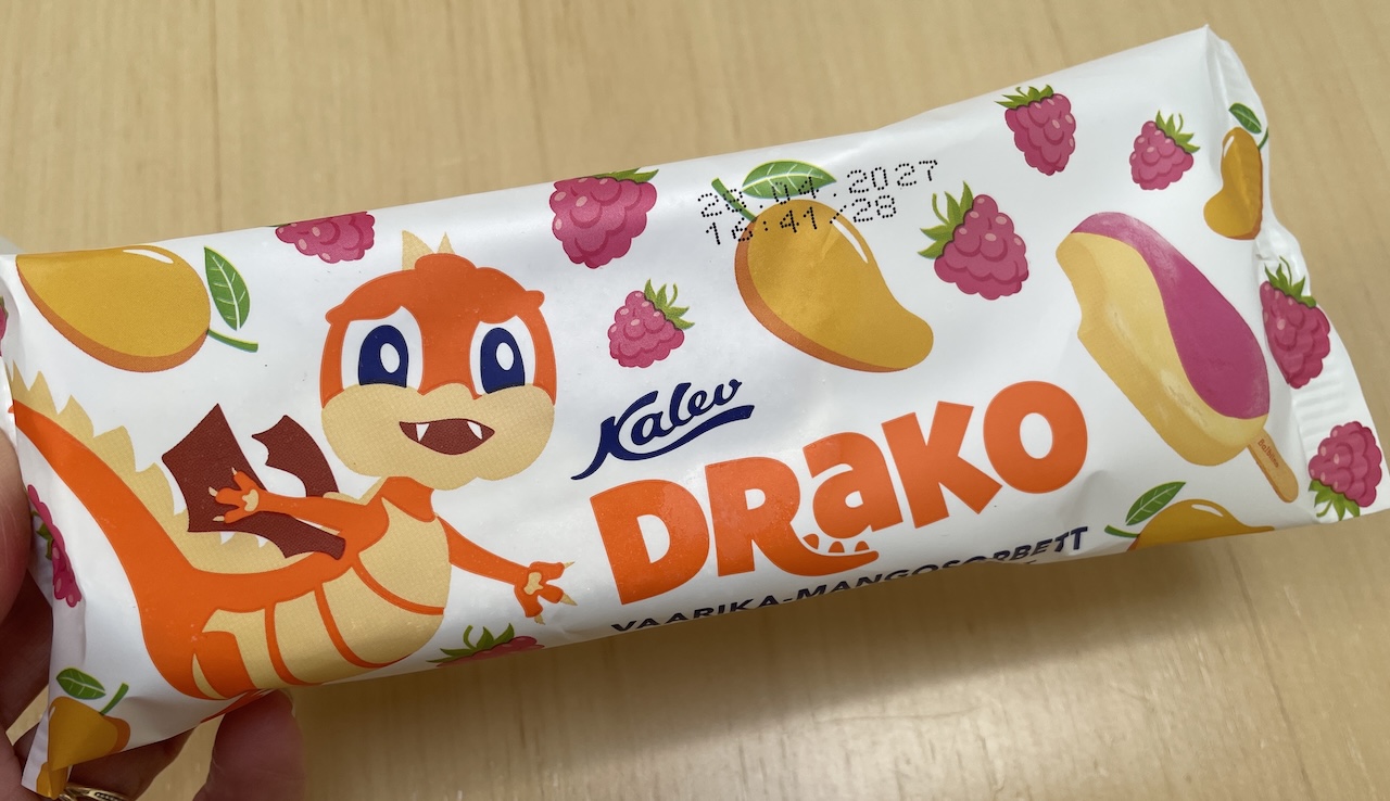
Packaging is one of those design objects where a beautiful image alone is not enough. It must contain information, comply with technical and legal requirements, be suitable for production – and finally, it must also catch the eye on the shelf.
It’s precisely the combination of constraints and possibilities that makes packaging design interesting to me. Sometimes it feels like there is no space at all. And yet, everything necessary still has to fit in there.
Read more…
Packaging design usually starts with very practical questions: dimensions, material, printing technology, mandatory text, and brand requirements. In the case of food packaging, there are also legal restrictions. My job is to combine these different layers into a whole so that the packaging functions technically, is recognizable, and gives the product a chance to be noticed on the shelf.
“Allergic to milk”
2018
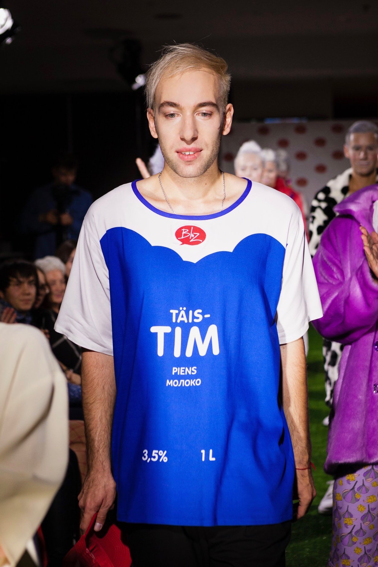
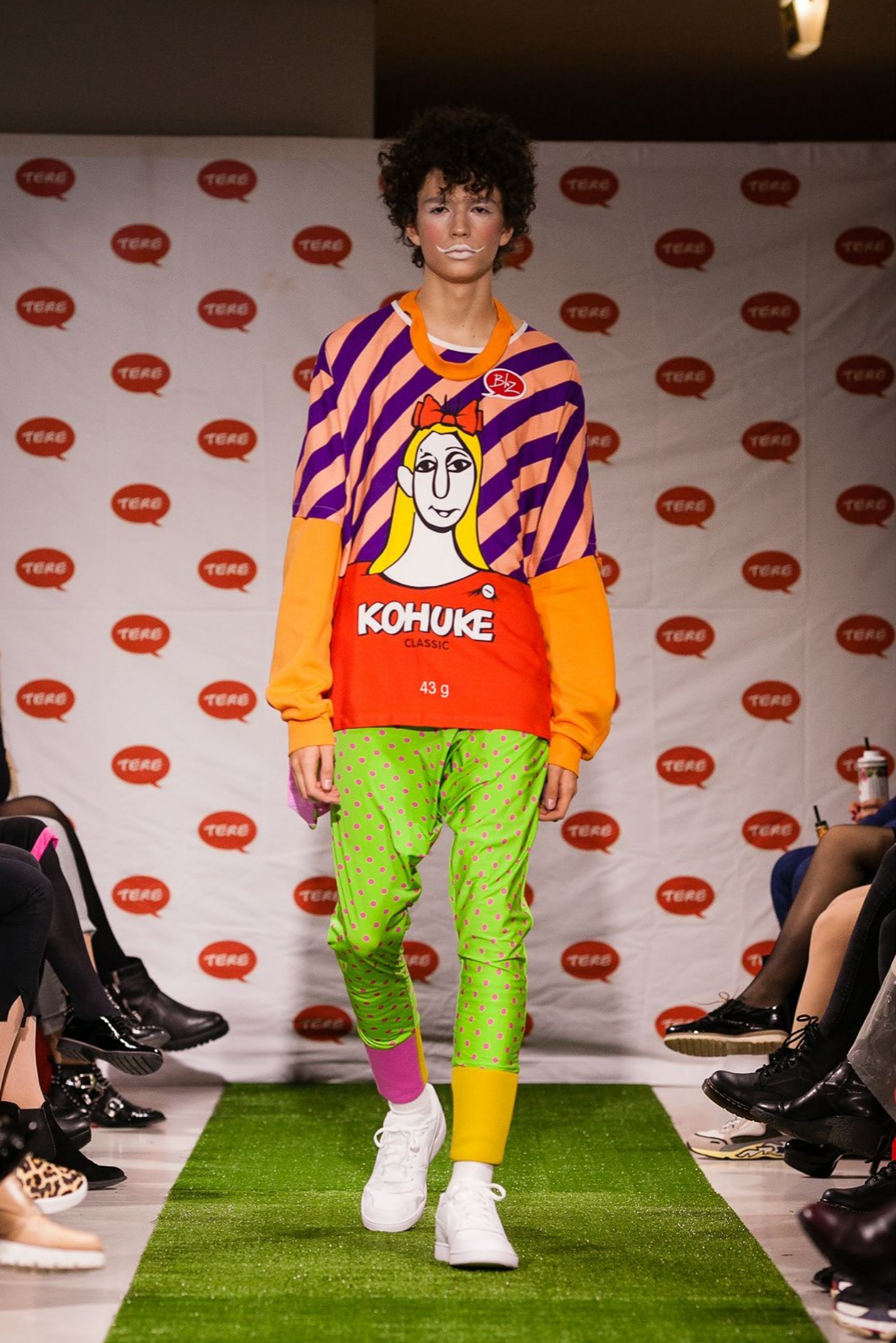
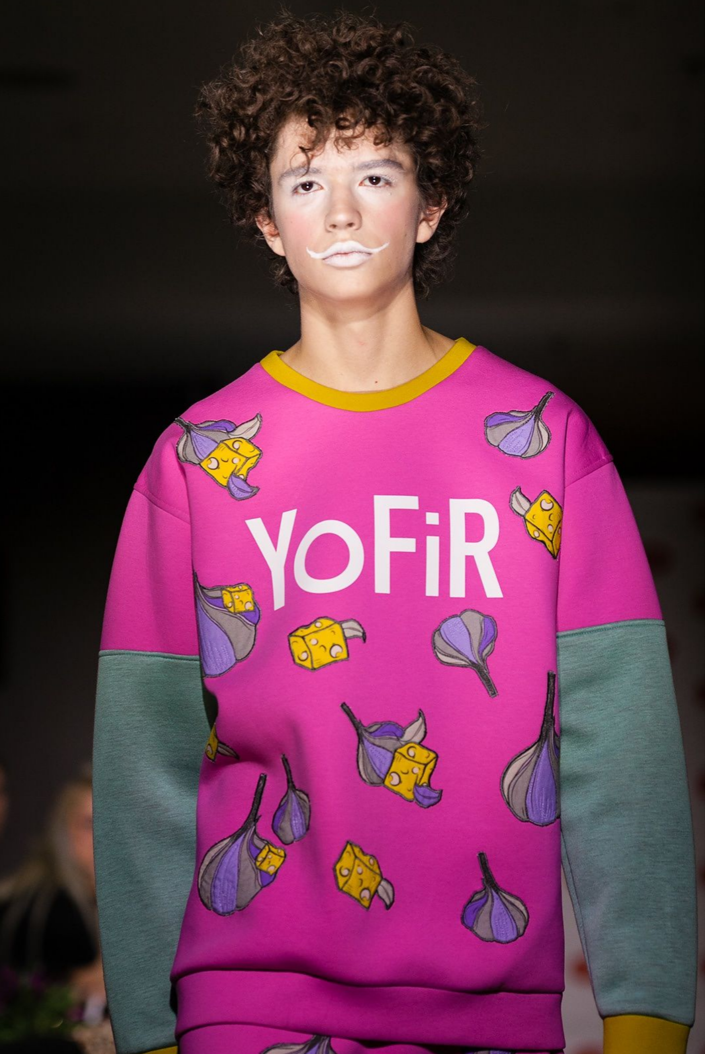
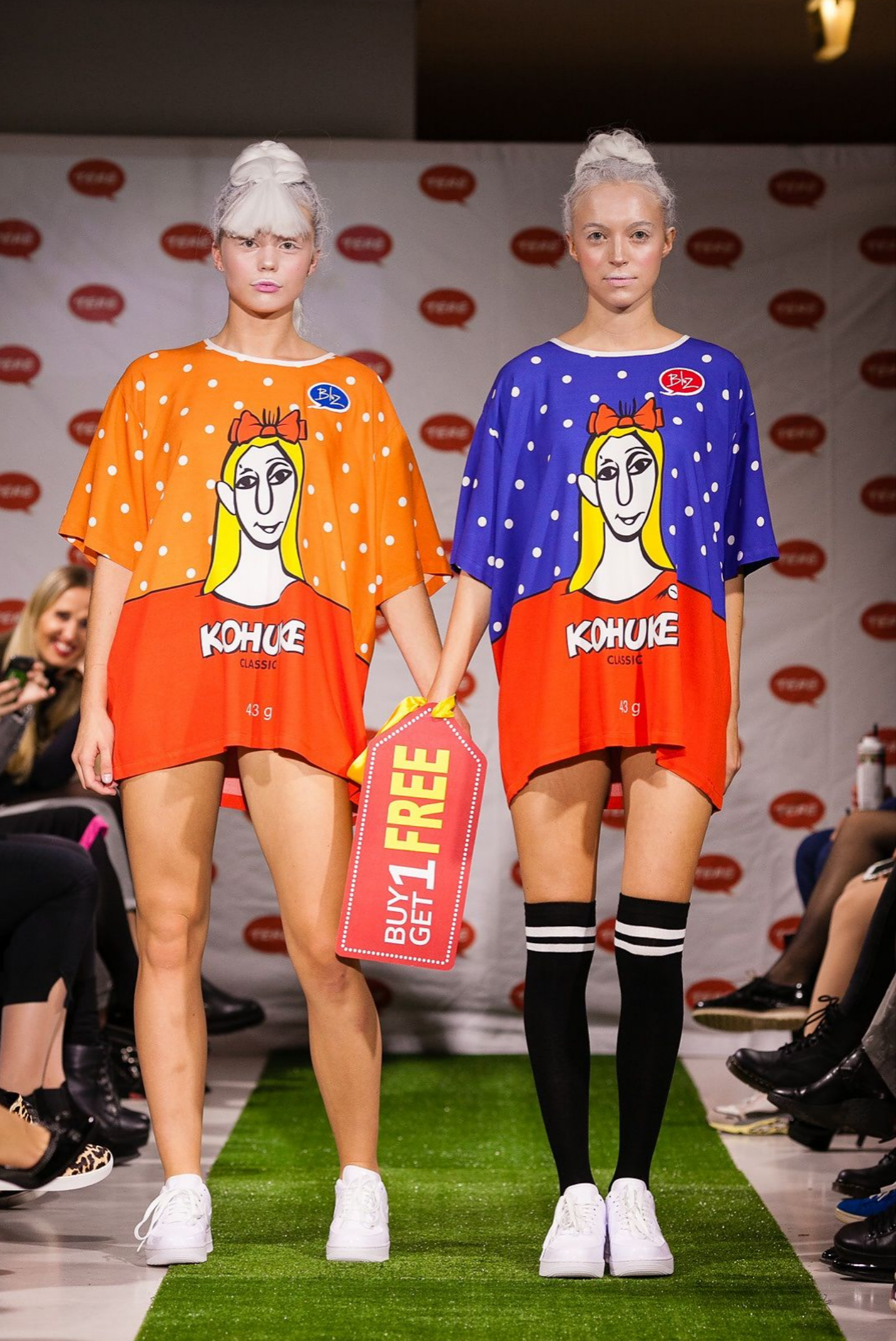
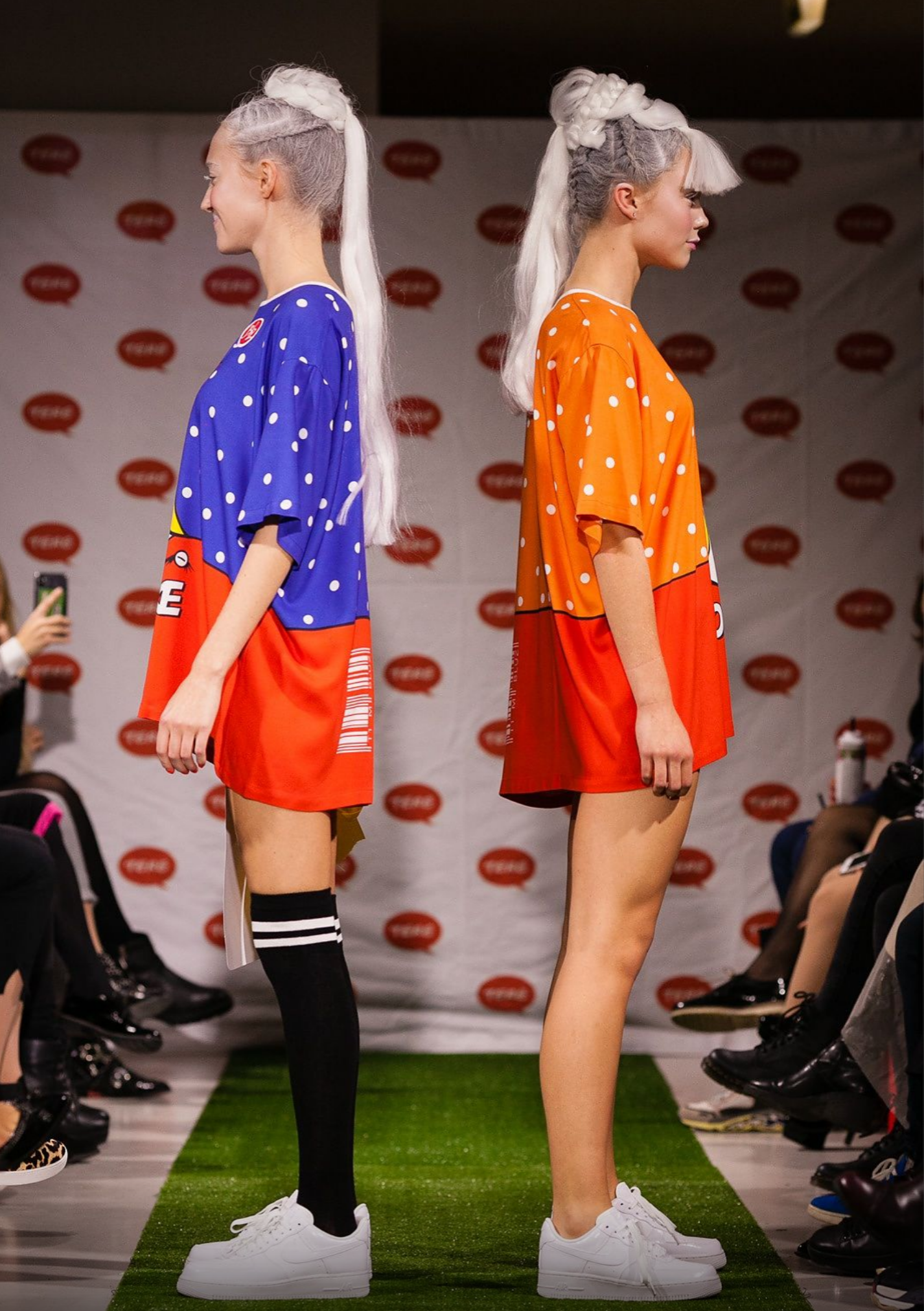
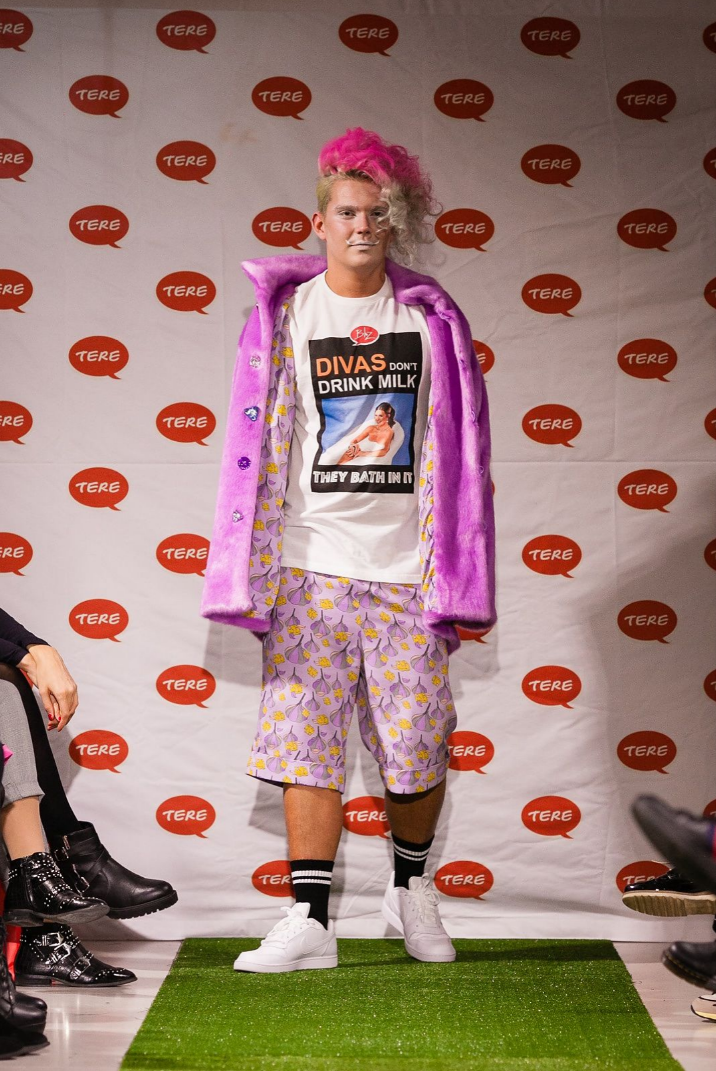
This is one of the more fun side projects of my design work. Designer Tim Bluz created the collection “Allergic to Milk,” which was inspired by Estonian dairy product packaging. If you can’t drink milk, at least you can wear it.
My role was to help bring the packaging graphics onto the fabric and the stage. Behind this were several months of experimentation, sketches, fabric samples, failures, and new attempts.
On the computer screen, everything looked the same, but on stage it was completely different. And that was the most exciting part of it.
News and photos can be viewed in the Anne & Stiil article.→Anne and Stiil’s Delfi story
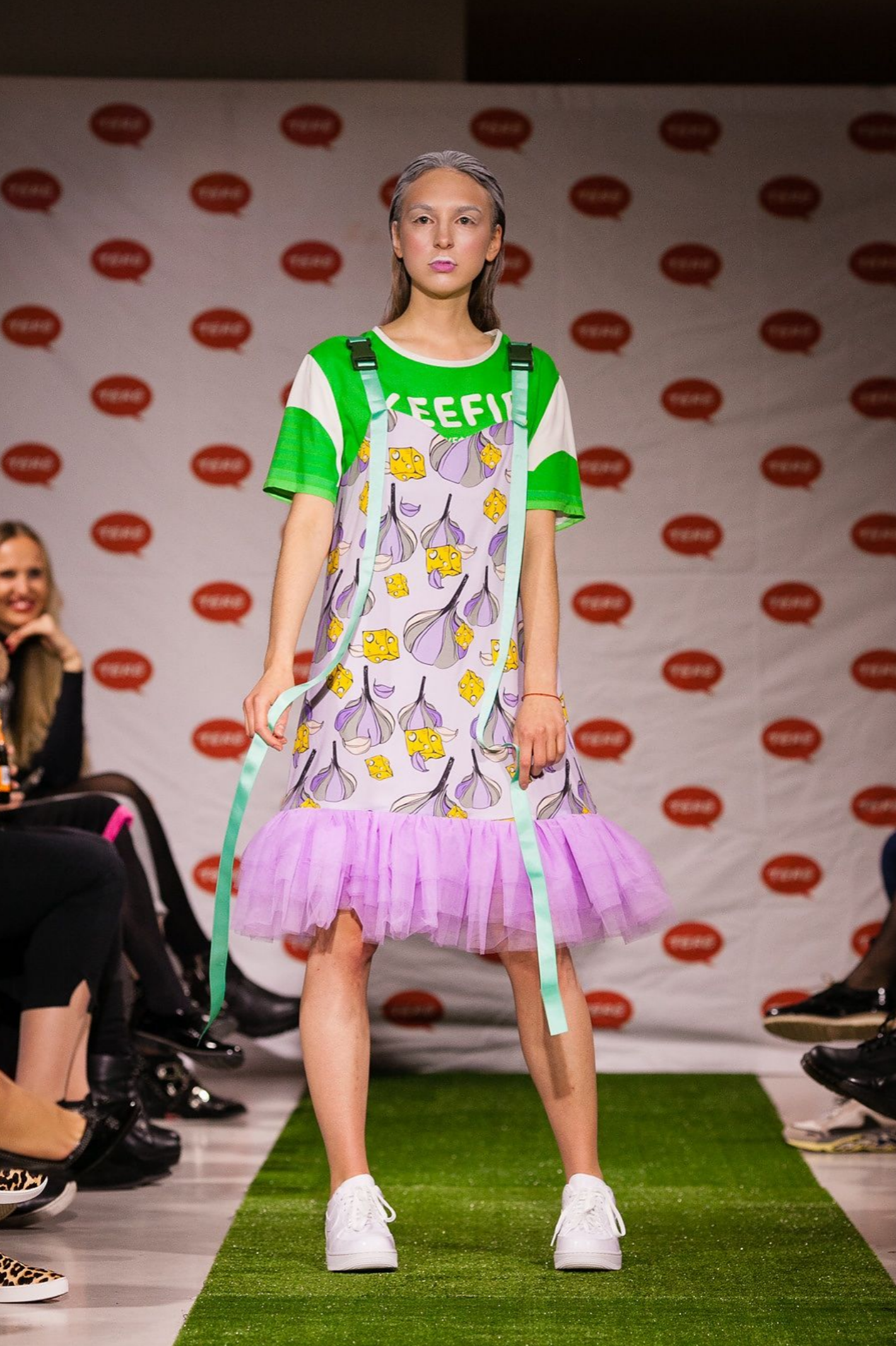
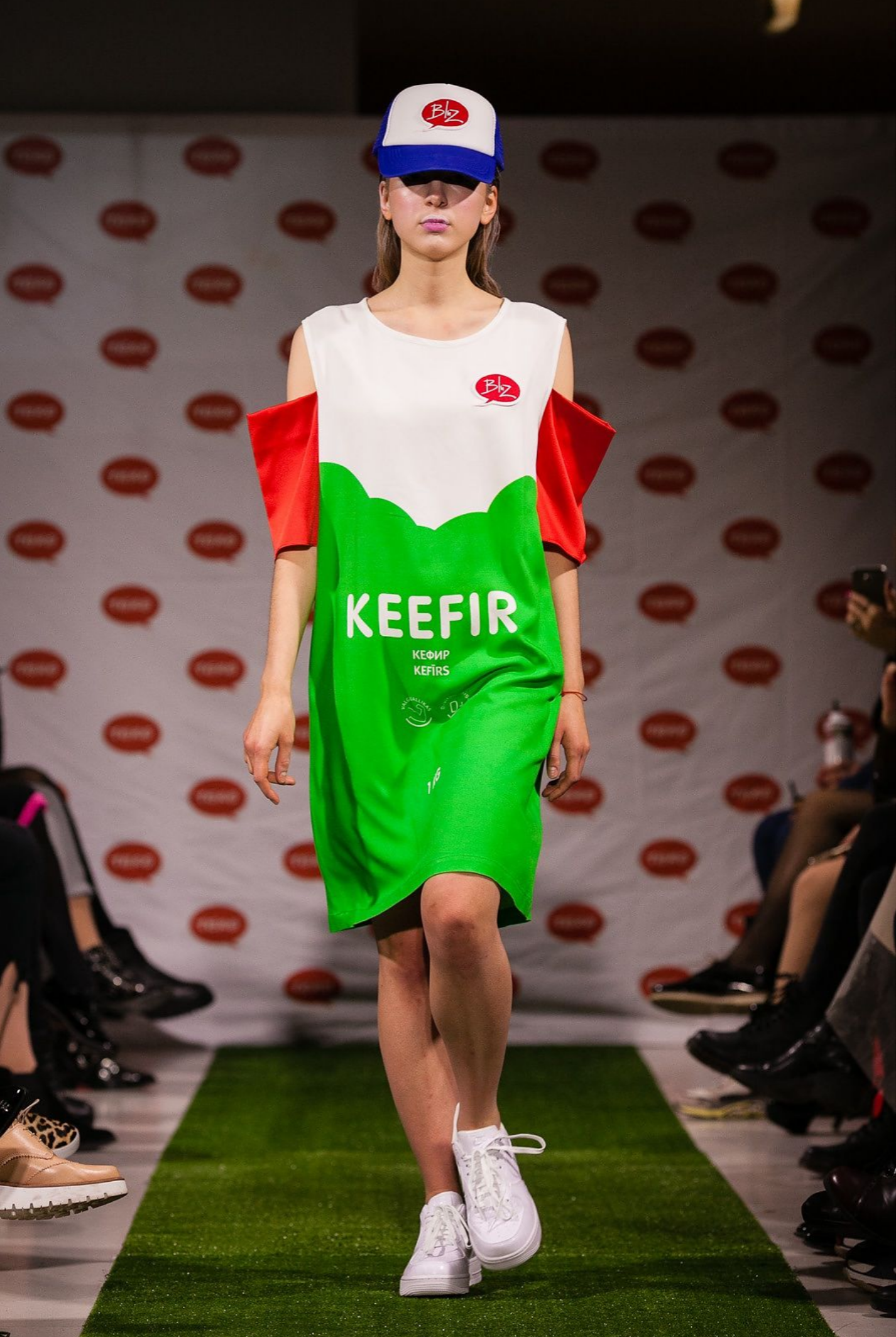
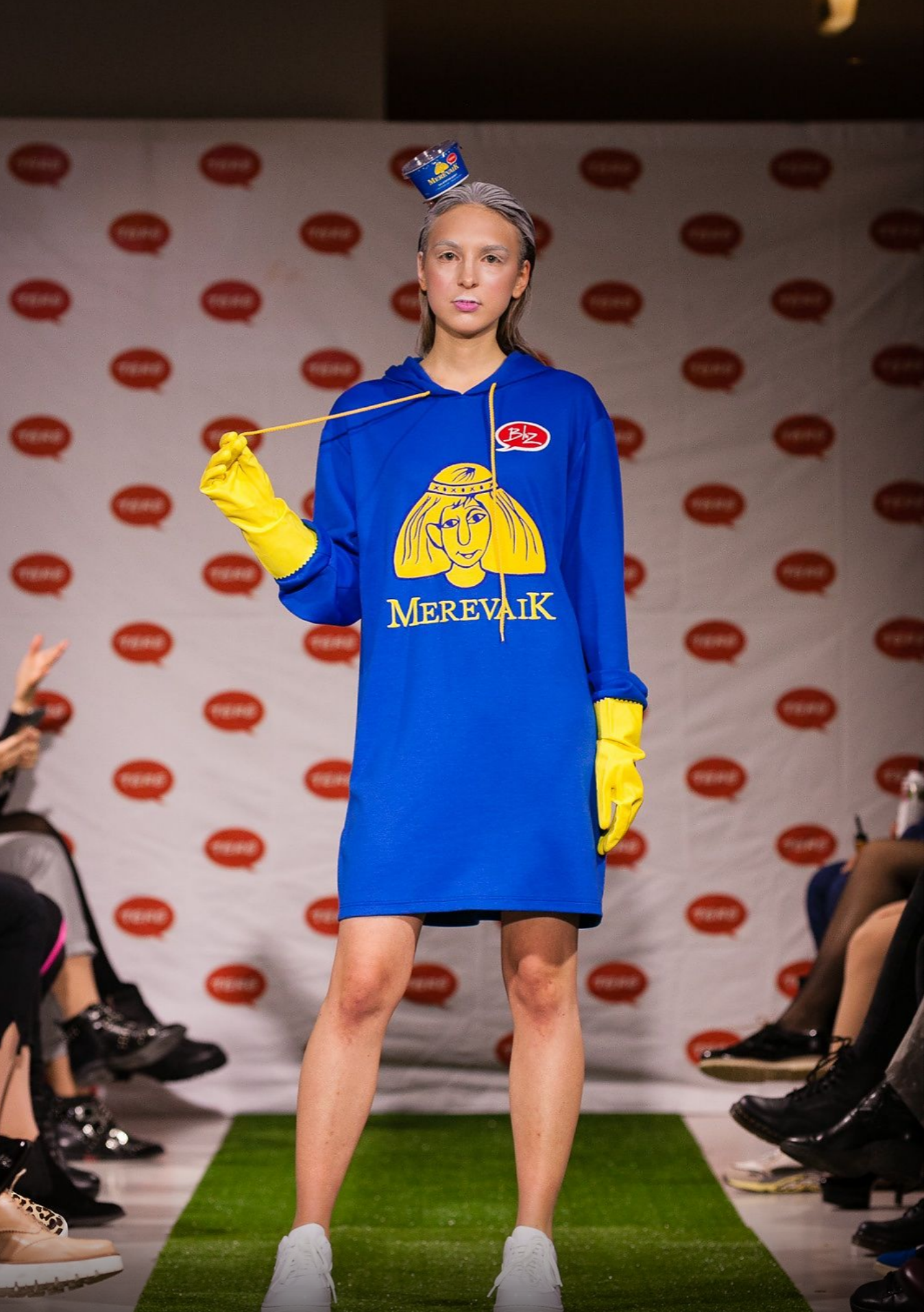

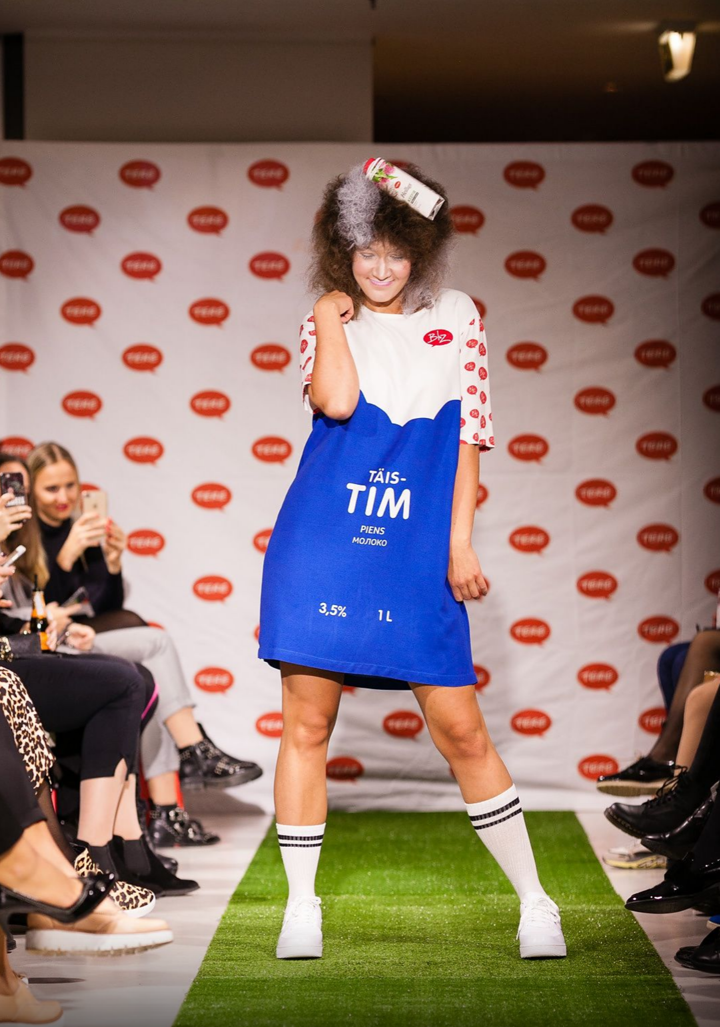
Photographer: Maksim Toome
Rae Golf Club visual identity
2017
The starting point for creating the visual identity of Rae Golf Club was simple: golf brings together precision, movement, and a lot of green space.
The goal was to create a mark and visual language that would work equally well as a logo, on a t-shirt, and as a small icon – clear, recognizable, and without excessive embellishment.
The result was an identity that could be used in different formats and centered around the feeling of movement.


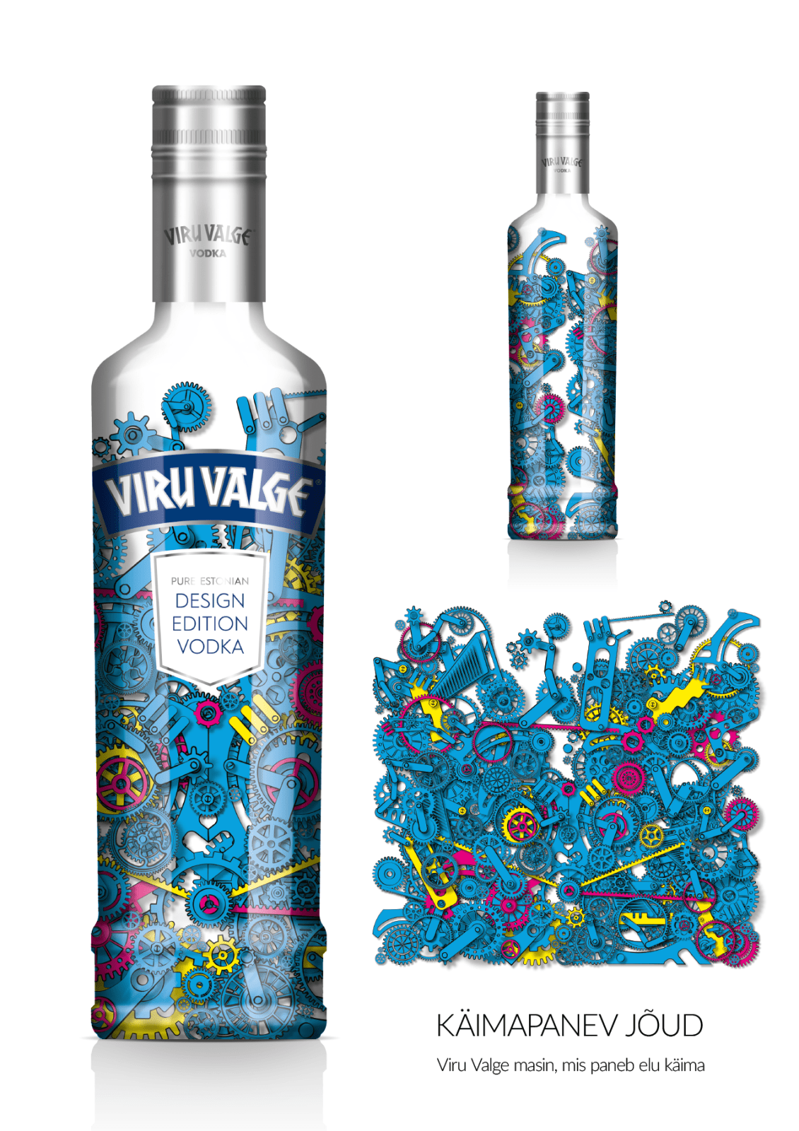
“Driving Force”
2015
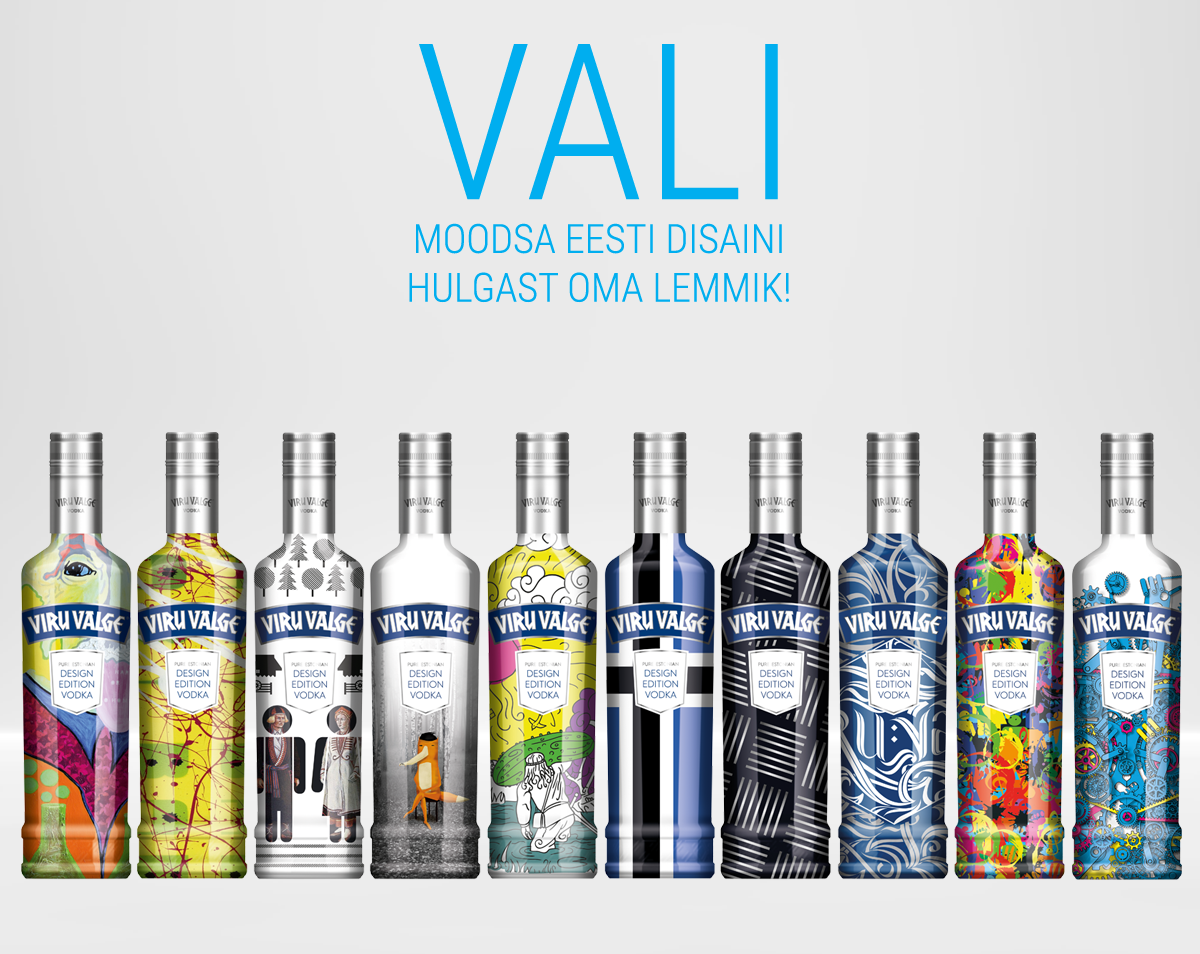
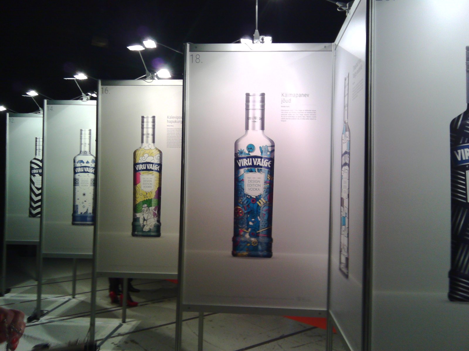
“Driving Force” was created in 2015 for Liviko’s Estonian product design competition. A total of 414 works were submitted, and my design was selected among the ten finalists. The aim of the competition was to find a new design for Viru Valge, and the finalists’ works were later exhibited together at Saku Suurhall.
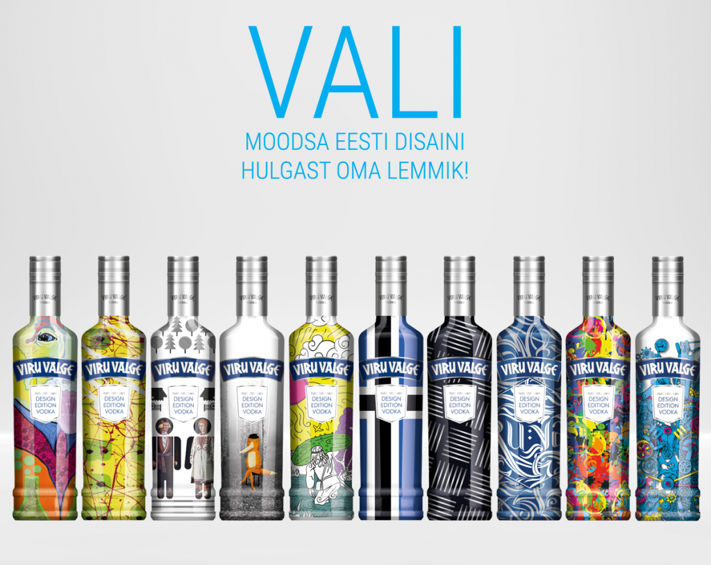
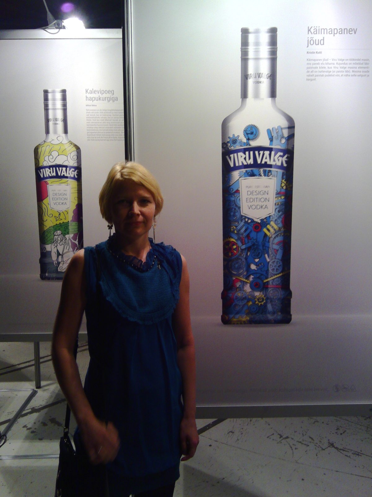
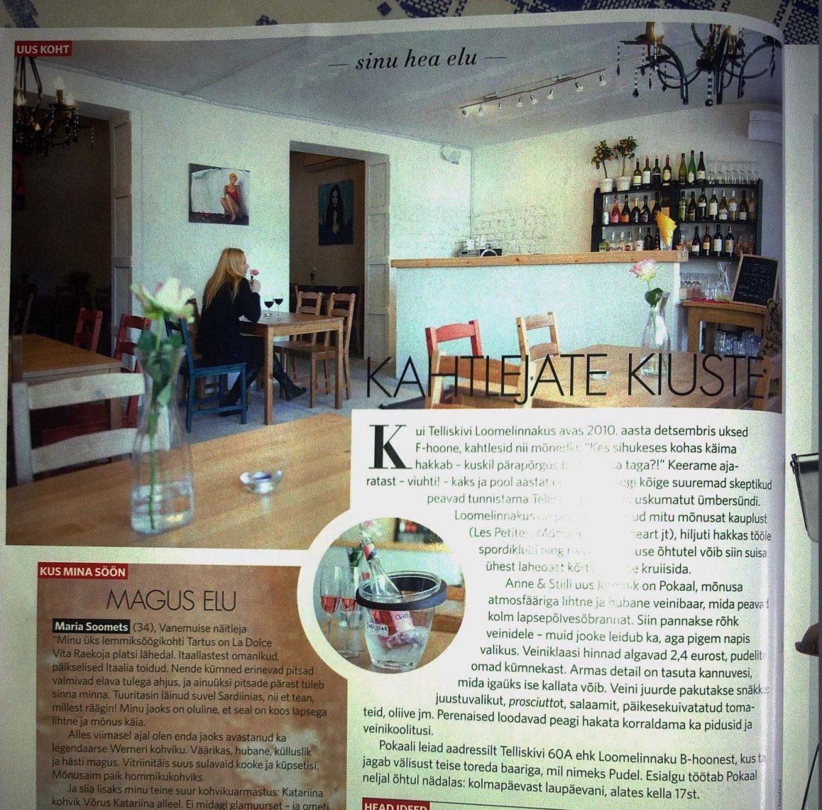
Exhibition at Telliskivi Wine Bar Pokaal
2013
A small note about the opening of the wine bar “Pokaal” in Telliskivi Creative City was published in the magazine Anne & Stiil (summer 2013). There was an exhibition of my paintings on the walls of the bar.
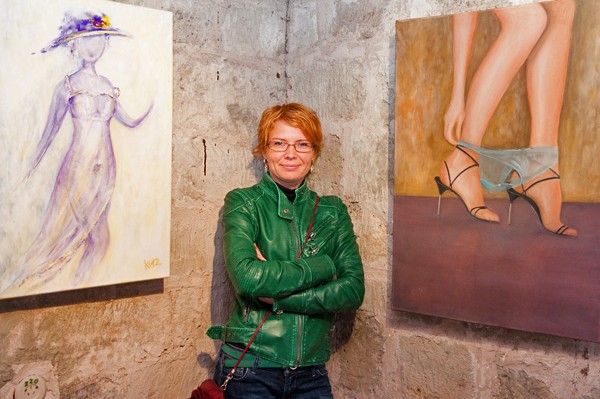
Exhibition “Women – Different and Similar”
2012
“For those who are not afraid to climb the stairs, reaching the upper floor of the Kuressaare Castle’s defensive tower can be rewarded with a worthy effort in the form of an exhibition experience. Because the paintings and graphics by Kristin Kutti, bursting with femininity, should not leave anyone indifferent…” This is what is said about the exhibition “Women – Different and Similar” in the tower café of Kuressaare Castle.Saarte Hääl.
The midday radio broadcast added a kind of aura of fame, and the paintings quickly found a new owner.
Thank youTo the Saaremaa Museumfor the exhibition invitation and organization!
Who am I
I work with graphic design daily, sometimes teach, and spend the rest of the time tending to painting, printing, photographing, or even planting. While precision and controlled results are important in design, in my art I experiment with techniques, push boundaries, and give more room to chance. As a teacher, I support creative freedom and help find a visual direction. As an artist, I am primarily interested in the interpretation of the moment. What exists right now may have already changed the next moment.
Reprodeductions
High-quality reproductions are also available for some original works. You can choose from ready-made sizes or request a suitable size.Learn more.
Workshops
From time to time, I share what I know. I conduct workshops and private lessons in art, crafts, and graphic design. If interestedget in touch!
Abstract Act From dawn to dusk Figures Flowers Birds Animals Landscape Sea Beach Winter Still life